
International Journal of Health Policy Planning(IJHPP)
ISSN: 2833-9320 | DOI: 10.33140/IJHPP
Impact Factor: 1.08


Review Article - (2026) Volume 5, Issue 1
Monitoring and Evaluation in Public Health: Concepts, Frameworks, Indicators, and Sectoral Applications
Received Date: Jan 06, 2026 / Accepted Date: Feb 20, 2026 / Published Date: Mar 03, 2026
Copyright: ©2026 Sandhya Ahuja. This is an open-access article distributed under the terms of the Creative Commons Attribution License, which permits unrestricted use, distribution, and reproduction in any medium, provided the original author and source are credited.
Citation: Ahuja, S. (2026). Monitoring and Evaluation in Public Health: Concepts, Frameworks, Indicators, and Sectoral Applications. Int J Health Policy Plann, 5(1), 01-35.
Abstract
This compendium brings together a structured approach to monitoring and evaluation across critical domains of public health, demonstrating how data collection, analysis, and digital innovations can be harnessed to improve decision- making, accountability, and outcomes.
We began with Child Health (4.2), emphasizing immunization coverage, under-five mortality, and nutrition status as key indicators. Cohort tracking, survival analysis, and tools like eVIN and RCH portals support the monitoring of child health outcomes. Growth charts, percentage formulas, and Excel-based immunization calculations offer practical approaches to analysis.
Communicable Diseases (4.3), were addressed through indicators such as TB treatment success rates, HIV prevalence, and malaria incidence. Trend and cohort analysis, along with drug adherence monitoring, highlight the importance of surveillance systems like Nikshay and IDSP. Excel case notification dashboards enable visual monitoring of programme effectiveness.
The section on Non-Communicable Diseases (4.4), focused on hypertension and diabetes, where screening, control rates, and mortality trends are central. Cohort tracking and regression analysis link risk factors with outcomes, while digital health tools such as the NCD App and population dashboards make management more systematic.
Vector-Borne Diseases (4.5), explored dengue and malaria incidence, API, and case fatality rates. Seasonal trend analysis, correlation with climate factors, and the use of GIS dashboards and mobile reporting tools were highlighted as essential to early outbreak detection and effective vector control.
In Family Planning (4.6), contraceptive prevalence, unmet need, and method-mix were key indicators. Cohort and equity lens analyses reveal disparities, while Excel tools (e.g., pie charts for method-mix) and FP apps integrated with HMIS facilitate continuous monitoring.
Health Financing (4.7), examined protection from catastrophic expenditure, insurance coverage, and PM-JAY utilization. Cross-tabulation with poverty quintiles, threshold calculations for OOPE, and real-time claims data dashboards were underscored as critical for assessing financial protection.
Climate Change and Health (4.8), highlighted the impact of heat, air pollution, rainfall, and extreme weather events on disease patterns. Correlation and regression with meteorological data, time-series analysis of AQI and ARIs, and geospatial mapping of outbreaks demonstrate the intersection of environment and health. AI-driven early warning systems and GIS dashboards represent the frontier of climate-health integration.
Disability Indicators (4.G), reinforced the importance of inclusive monitoring. Prevalence by gender and geography, type-specific disability rates, and digitalization via UDID and GIS mapping ensure that persons with disabilities are not excluded from health planning and accountability frameworks. Moving into the methods of practice, Section 5 (Methods of Data Collection s Analysis) outlined the importance of surveys (NFHS, DLHS, NSSO), routine HMIS data, sentinel surveillance, and qualitative approaches like FGDs and IDIs. Mixed-methods evaluations were emphasized as providing triangulated evidence for robust decision- making.
Section 6 (Using Excel in MsE), highlighted Excel’s versatility for public health analysis, covering basic formulas (SUM, AVERAGE, COUNTIF, IF), pivot tables, charts, conditional formatting, and dashboards. Excel remains the most accessible entry point for data analysis across all levels.
Section 7 (Digitalization and Innovations), explored the transformative role of e-health platforms, m-health apps, AI, and big data. Programme-specific systems like Nikshay, eVIN, and IDSP were highlighted as successful examples, while challenges of interoperability and data privacy were acknowledged.
Section 8 (Interpretation and Use of Findings), focused on the critical transition from data to action. Interpretation requires contextualizing results against benchmarks and disaggregating by equity dimensions. Findings should be tailored for policymakers, programme managers, and communities, ensuring accountability and translation into policy and practice. Finally, Section 9 (Conclusion) reinforced the need for robust MCE systems that evolve from data collection to data use. The future lies in integrated, predictive, and digital ecosystems that incorporate AI, big data, and “One Health” approaches. Strong MCE ensures that health systems remain resilient, equitable, and adaptive to challenges such as pandemics and climate change.
Introduction
Understanding Monitoring and Evaluation in Public Health
Monitoring and Evaluation (commonly abbreviated as M&E) are essential pillars of modern public health systems. They ensure that programs are not only implemented as planned but also achieve their intended outcomes. While monitoring focuses on the continuous collection and analysis of information during program implementation, evaluation looks at the deeper question of whether the intervention worked, why it worked, and at what cost. In simple terms, monitoring asks “Are we doing things, right?” whereas evaluation asks “Are we doing the right things?”. Together, they form a feedback loop that helps governments, health agencies, and communities improve performance, allocate resources wisely, and generate evidence for policymaking.
Why M&E is Critical in Public Health
Public health programs are complex. They operate across multiple sectors, involve large populations, and often require significant investments of money, human resources, and infrastructure. Without effective monitoring, programs may drift from their objectives; without evaluation, policymakers may never know if the efforts produced meaningful change.
Some key reasons why MCE is indispensable in public health are:
• Accountability: Governments and donors need proof that funds are being used effectively and that commitments are being met.
• Transparency: Citizens, civil society, and media can hold institutions accountable when results are reported openly.
• Learning and Improvement: MCE identifies both successes and bottlenecks, allowing continuous program improvement.
• Evidence-Based Policy: Findings from evaluations provide the evidence required to design new strategies or scale up successful interventions.
• Global Reporting: International frameworks like the Sustainable Development Goals (SDGs) depend on robust MCE systems to track progress across countries.
Monitoring vs. Evaluation – A Comparative Lens
Although they are interlinked, monitoring and evaluation differ in scope, timing, and purpose.
|
Aspect |
Monitoring |
Evaluation |
|
Definition |
Continuous tracking of activities and outputs during program implementation. |
Periodic assessment of the relevance, effectiveness, efficiency, and impact of a program. |
|
Main Question |
Are activities being implemented as planned? |
Did the program achieve its objectives? Why or why not? |
|
Time frame |
Ongoing (daily, monthly, quarterly). |
Conducted at specific points (mid-term, end line, or post-implementation). |
|
Focus |
Inputs, processes, outputs. |
Outcomes and impacts. |
|
Data Sources |
Routine reports, HMIS, checklists, dashboards. |
Surveys, research studies, cost-effectiveness analyses, mixed-methods evaluations. |
|
Users |
Program managers, implementers. |
Policymakers, donors, communities, researchers. |
Table 1: Monitoring vs Evaluation – A Comparative Lens
Real-World Illustrations
• Maternal Health: Monitoring may involve tracking the number of antenatal check-ups provided each month. Evaluation, on the other hand, will look at whether the overall program contributed to reducing maternal mortality in a district or state.
• Immunization: Monitoring records how many vaccines were delivered and to which facilities. Evaluation assesses whether immunization campaigns led to improved coverage and reduced child mortality.
• Non-communicable Diseases (NCDs): Monitoring keeps an eye on how many people are screened for hypertension. Evaluation examines whether screening and treatment programs led to better blood pressure control and reduced hospitalization rates.
The Indian and Global Context
India has invested heavily in building monitoring systems such as the Health Management Information System (HMIS), Reproductive and Child Health (RCH) portal, Nikshay for TB, and IDSP for epidemic surveillance. These platforms provide daily or monthly monitoring data. Evaluation is carried out through large-scale surveys like the National Family Health Survey (NFHS), Sample Registration System (SRS), and periodic program reviews. Globally, agencies such as the World Health Organization (WHO), World Bank, and UNICEF emphasize MCE as a foundation of effective health governance. For example, the WHO’s “Results-Based Management Framework” guides countries in designing programs with measurable indicators that can be monitored and evaluated systematically.
The Flow of this Article
This article builds on the introduction by first clarifying concepts and definitions (inputs, outputs, outcomes, impacts, indicators). It then explores frameworks that structure MCE activities. The core of the article is sector- specific: how to design, monitor, and evaluate programs in areas such as maternal health, child health, communicable and non-communicable diseases, vector-borne diseases, family planning, health financing and Climate Change. Practical tools like Excel formulas, dashboards, and digital platforms are integrated throughout to show how MCE can be operationalized at program level. Finally, the article highlights how findings should be interpreted and used by decision-makers for stronger policies and healthier populations.
Core Concepts and Terminology (Expanded)
Inputs
• Definition and Concept: Inputs are the financial, human, and material resources invested in a program. They form the foundation on which all public health interventions are built. Inputs can include budget allocations, trained human resources, medicines and vaccines, infrastructure such as hospitals and laboratories, and even intangible resources such as policies, guidelines, and political support.
• Explanation: Without adequate inputs, programs cannot begin. They represent the capacity of a health system to act. Monitoring inputs helps ensure that the planned resources actually reach the implementing agencies and are used appropriately. It also provides early warning if bottlenecks are developing, such as shortages of staff or delays in procurement.
• Example in Public Health
![]() In a maternal health program, inputs may include:
In a maternal health program, inputs may include:
• Trained midwives, obstetricians, and nurses.
• Antenatal care kits with blood pressure monitors, hemoglobin tests, and iron-folic acid tablets.
• Budget for outreach activities, transport vouchers for pregnant women, and construction of maternity wards.
![]() In a malaria control program, inputs include insecticide-treated bed nets, indoor residual sprays, rapid diagnostic kits, and trained vector-control workers.
In a malaria control program, inputs include insecticide-treated bed nets, indoor residual sprays, rapid diagnostic kits, and trained vector-control workers.
• Relevance: Monitoring inputs is not just about “counting resources.” It ensures equity: Are rural health centers receiving the same supplies as urban ones? Are tribal populations getting adequate staff and funds? Such monitoring helps identify systemic gaps in resource allocation.
Activities / Processes
• Definition and Concept: Activities (or processes) are the specific actions and interventions carried out using the inputs. They represent the operational side of public health programs. Activities translate resources into services delivered on the ground.
• Explanation: Activities are the link between inputs and results. Even with abundant resources, if activities are not implemented well, outputs will be poor. Activities can be preventive (health education, vaccinations), promotive (awareness campaigns), curative (treatment services), or supportive (training, supervision, monitoring).
• Example in Public Health
![]() In maternal health: Conducting antenatal check-ups, organizing safe delivery camps, providing counselling on nutrition and birth preparedness.
In maternal health: Conducting antenatal check-ups, organizing safe delivery camps, providing counselling on nutrition and birth preparedness.
![]() In immunization: Organizing village-level vaccination sessions, cold chain management, and mobilizing community volunteers to ensure attendance.
In immunization: Organizing village-level vaccination sessions, cold chain management, and mobilizing community volunteers to ensure attendance.
![]() In vector-borne disease control: Carrying out fogging, community awareness campaigns on stagnant water, and training health workers in case detection.
In vector-borne disease control: Carrying out fogging, community awareness campaigns on stagnant water, and training health workers in case detection.
• Relevance: Monitoring activities helps ensure that interventions are delivered on schedule and at the required quality. For example, simply counting how many vaccination sessions were planned versus how many actually happened is an essential monitoring task.
Outputs
• Definition and Concept: Outputs are the immediate results of program activities. They are tangible, measurable, and usually expressed in numbers. Outputs show whether services are reaching the target population.
• Explanation: Outputs do not measure health improvements directly but rather the coverage of services. They are crucial for short-term program management: Are vaccines being given? Are health workers trained? Are drugs being distributed?
• Example in Public Health
![]() Maternal Health: Number of pregnant women who received four or more ANC visits; number of institutional deliveries.
Maternal Health: Number of pregnant women who received four or more ANC visits; number of institutional deliveries.
![]() Child Health: Number of children vaccinated against measles; number of malnourished children admitted to Nutrition Rehabilitation Centers.
Child Health: Number of children vaccinated against measles; number of malnourished children admitted to Nutrition Rehabilitation Centers.
![]() Tuberculosis: Number of patients registered under DOTS.
Tuberculosis: Number of patients registered under DOTS.
• Relevance: Outputs are often reported monthly or quarterly. They allow managers to quickly identify underperforming areas. For instance, if only 40% of planned immunization sessions were conducted in a district, corrective actions can be taken immediately.
Outcomes
• Definition and Concept: Outcomes are the short- to medium-term changes in behaviour, knowledge, practices, or coverage that result from outputs. They reflect whether services delivered are actually leading to improvements among the target population.
• Explanation: Outcomes are more meaningful than outputs because they show whether people are benefitting. They measure effectiveness of the program in achieving its objectives. Outcomes may take months or years to manifest
• Example in Public Health
![]() Maternal Health: Proportion of women delivering in health institutions (institutional delivery rate).
Maternal Health: Proportion of women delivering in health institutions (institutional delivery rate).
![]() Child Health: Increase in percentage of fully immunized children (12–23 months).
Child Health: Increase in percentage of fully immunized children (12–23 months).
![]() HIV: Proportion of people living with HIV receiving antiretroviral therapy (ART coverage).
HIV: Proportion of people living with HIV receiving antiretroviral therapy (ART coverage).
• Relevance: Monitoring outcomes provides evidence that programs are on track to achieve impacts. If institutional delivery rates improve after increasing ANC coverage, it suggests the program is working. If not, deeper evaluation is required to understand barriers.
Impact
• Definition and Concept: Impact refers to the long-term, sustained changes in health status, economic productivity, or quality of life. It is the ultimate goal of public health interventions. Impacts are usually measured at the population level and require large-scale evaluations.
• Explanation: Impacts are influenced by many factors, not just one program. For example, maternal mortality reduction may be due to better obstetric care, improved nutrition, increased female education, and poverty reduction. Hence, impacts are often attributed to a combination of interventions.
• Example in Public Health
![]() Reduction in maternal mortality ratio (MMR).
Reduction in maternal mortality ratio (MMR).
![]() Decline in infant mortality rate (IMR) and under-five mortality rate (U5MR).
Decline in infant mortality rate (IMR) and under-five mortality rate (U5MR).
![]() Lower prevalence of tuberculosis or malaria in a region.
Lower prevalence of tuberculosis or malaria in a region.
• Relevance: Impact evaluation is critical for justifying investments. Donors and governments want to know: Did this program actually save lives? Did it reduce disease burden? Impacts are also essential for global reporting against SDGs.
Indicators
• Definition and Concept: Indicators are specific, observable, and measurable variables that show whether progress is being made towards achieving program objectives. In Monitoring and Evaluation (MCE), indicators act as signposts that translate abstract goals into tangible, quantifiable terms. They are used to track change over time, compare across regions or groups, and assess whether interventions are leading to desired outcomes. In public health, indicators are not just numbers but reflections of the health status, service coverage, and system performance of populations. They can be simple counts (e.g., number of vaccines given) or complex rates and ratios (e.g., maternal mortality ratio).
• Explanation: Indicators exist at every stage of the results chain
![]() Input Indicators measure the resources provided (e.g., number of doctors appointed, budget released).
Input Indicators measure the resources provided (e.g., number of doctors appointed, budget released).
![]() Process Indicators measure whether planned activities are being implemented (e.g., % of planned immunization sessions conducted).
Process Indicators measure whether planned activities are being implemented (e.g., % of planned immunization sessions conducted).
![]() Output Indicators measure immediate service delivery results (e.g., number of children vaccinated).
Output Indicators measure immediate service delivery results (e.g., number of children vaccinated).
![]() Outcome Indicators measure medium-term coverage or behavior change (e.g., percentage of children aged 12–23 months fully immunized).
Outcome Indicators measure medium-term coverage or behavior change (e.g., percentage of children aged 12–23 months fully immunized).
![]() Impact Indicators measure long-term effects (e.g., under-five mortality rate, TB incidence per 100,000).
Impact Indicators measure long-term effects (e.g., under-five mortality rate, TB incidence per 100,000).
|
Type of Indicator |
Indicator |
Example Program Area |
|
Input |
Number of doctors recruited |
Health Workforce |
|
Input |
Budget allocated for maternal health |
Maternal Health |
|
Process |
Percentage of planned immunization sessions conducted |
Child Health / Immunization |
|
Process |
Percentage of TB microscopy centers reporting on time |
Communicable Diseases |
|
Output |
Number of pregnant women receiving 4+ ANC visits |
Maternal Health |
|
Maternal Health |
Number of children vaccinated against measles |
Child Health |
|
Outcome |
Institutional delivery rate (%) |
Maternal Health |
|
Outcome |
Percentage of children fully immunized (12–23 months) |
Child Health |
|
Impact |
Maternal Mortality Ratio (MMR) |
Maternal Health |
|
Impact |
Under-Five Mortality Rate (U5MR) |
Child Health |
Table 2: Good Indicators must Be SMART Specific, Measurable, Achievable, Relevant, and Time-Bound. This Ensures they are Realistic, Scientifically Valid, and Actionable
Example in Public Health
Take the example of an immunization program
• Input Indicator: Number of cold chain points established.
• Process Indicator: Percentage of planned immunization sessions conducted in the quarter.
• Output Indicator: Number of children vaccinated with the first dose of measles vaccine.
• Outcome Indicator: Percentage of children 12–23 months fully immunized.
• Impact Indicator: Reduction in under-five mortality rate (U5MR).
Another Example is in Maternal Health
• Outcome Indicator: Institutional delivery rate (% of women delivering in health facilities).
• Impact Indicator: Maternal mortality ratio (MMR).
Relevance
Indicators are the backbone of Monitoring and Evaluation. Without indicators, programs cannot measure performance, track equity, or justify resource allocation. Their relevance lies in:
• Program Management – Help managers monitor progress in real time.
• Accountability – Provide evidence to governments, donors, and communities about program achievements.
• Decision-Making – Allow policymakers to priorities interventions and allocate resources effectively.
• Equity Tracking – Disaggregated indicators (by age, sex, wealth quintile, rural/urban) reveal who is left behind.
• Global Comparability – Indicators enable countries to report progress towards SDGs and WHO targets, ensuring international benchmarking. In essence, indicators are the language of evidence in public health.
They connect day-to-day program activities with long-term health outcomes and help transform raw data into actionable insights.
Smart Indicators
• Definition and Concept: SMART indicators are those designed to be Specific, Measurable, Achievable, Relevant, and Time-bound. The SMART framework is widely used in monitoring and evaluation to ensure that indicators are well-defined and practical for measuring program performance. The idea is simple: vague goals like “improve maternal health” are not useful unless broken into precise, measurable indicators such as “Reduce maternal mortality ratio to below 70 per 100,000 live births by 2030.” SMART indicators remove ambiguity and help focus on measurable change.
• Explanation: Each element of the SMART framework adds value
![]() Specific – The indicator must clearly define what is being measured and for whom. Example: “Proportion of pregnant women receiving at least four ANC visits.”
Specific – The indicator must clearly define what is being measured and for whom. Example: “Proportion of pregnant women receiving at least four ANC visits.”
![]() Measurable – The indicator should be quantifiable with available tools and data systems.
Measurable – The indicator should be quantifiable with available tools and data systems.
![]() Example: “Number of children aged 12–23 months fully immunised” can be measured through HMIS or NFHS.
Example: “Number of children aged 12–23 months fully immunised” can be measured through HMIS or NFHS.
![]() Achievable – The target should be realistic given program capacity and resources. Setting an unrealistic goal demotivates implementers.
Achievable – The target should be realistic given program capacity and resources. Setting an unrealistic goal demotivates implementers.
![]() Relevant – The indicator must align with the program’s objectives and broader health goals. For maternal health, relevant indicators include ANC visits, institutional deliveries, and maternal mortality.
Relevant – The indicator must align with the program’s objectives and broader health goals. For maternal health, relevant indicators include ANC visits, institutional deliveries, and maternal mortality.
![]() Time-bound – The indicator should specify the timeframe within which progress will be assessed. Example: “Increase institutional deliveries from 70% to 85% by 2025.”
Time-bound – The indicator should specify the timeframe within which progress will be assessed. Example: “Increase institutional deliveries from 70% to 85% by 2025.”
• Example in Public Health: In an immunisation program, a vague goal like “Improve immunisation coverage” is not SMART. A SMART indicator would be:
“Percentage of children aged 12–23 months who are fully immunised by 2025, as measured through NFHS surveys and HMIS data.”
• Similarly, in non-communicable disease programs, a SMART indicator could be:
“Proportion of adults aged 30–4S years screened for hypertension at least once in the last 12 months by 2027.”
These indicators specify the population, define the measurement, set achievable targets, remain relevant to national goals, and are bounded by time.
• Relevance
SMART indicators are critical for the effectiveness of MCE systems:
![]() Clarity --- They reduce confusion and ensure all stakeholders understand what is being measured.
Clarity --- They reduce confusion and ensure all stakeholders understand what is being measured.
![]() Accountability – They provide precise benchmarks for governments and donors.
Accountability – They provide precise benchmarks for governments and donors.
![]() Comparability – SMART indicators allow cross-district, cross-country, and over-time comparisons.
Comparability – SMART indicators allow cross-district, cross-country, and over-time comparisons.
![]() Evidence-based Action – They help policymakers track progress, identify bottlenecks, and revise strategies.
Evidence-based Action – They help policymakers track progress, identify bottlenecks, and revise strategies.
![]() Motivation – Achievable and time-bound targets keep program staff focused and motivated
Motivation – Achievable and time-bound targets keep program staff focused and motivated
In essence, SMART indicators convert broad health ambitions into actionable evidence, bridging the gap between planning and measurable impact.
|
SMART Component |
Definition |
Example in Public Health |
|
Specific |
Clearly define what is being measured and for whom. |
Proportion of pregnant women receiving at least 4 ANC visits. |
|
Measurable |
Indicator must be quantifiable using existing tools and data systems. |
Percentage of children aged 12–23 months fully immunized (NFHS/HMIS). |
|
Achievable |
Target should be realistic and feasible within available resources and capacity. |
Increase institutional deliveries from 70% to 80% in 3 years. |
|
Relevant |
Indicator should align with program objectives and overall health goals. |
Monitoring maternal mortality ratio (MMR) aligns with SDG 3.1 goals. |
|
Time-bound |
Indicator should specify the timeframe within which progress is measured. |
Reduce under-five mortality rate (U5MR) to below 25 per 1,000 live births by 2030. |
Baseline, Midline, and End Line
• Definition and Concept: In monitoring and evaluation, baseline, midline, and end line measurements represent key reference points in the program cycle. They provide data at the beginning, during, and at the end of a program to assess whether changes have occurred.
![]() Baseline: The initial measurement, collected before program implementation. It provides the “starting point” for comparison.
Baseline: The initial measurement, collected before program implementation. It provides the “starting point” for comparison.
![]() Midline: An interim measurement taken partway through implementation to assess progress and adjust.
Midline: An interim measurement taken partway through implementation to assess progress and adjust.
![]() End Line: The final measurement conducted after the program has run its course, to determine whether goals were achieved.
End Line: The final measurement conducted after the program has run its course, to determine whether goals were achieved.
• Explanation: These three measurements form the backbone of impact assessment:
![]() Baseline tells us the initial status of the population before intervention. Without it, change cannot be measured.
Baseline tells us the initial status of the population before intervention. Without it, change cannot be measured.
![]() Midline acts as a “progress checkpoint.” It helps managers understand whether the program is moving in the right direction or requires course correction.
Midline acts as a “progress checkpoint.” It helps managers understand whether the program is moving in the right direction or requires course correction.
![]() End Line provides the final results and is compared with the baseline to measure success or failure.
End Line provides the final results and is compared with the baseline to measure success or failure.
Together, they enable before-and-after comparisons, which are for attributing changes to a specific intervention rather than natural trends or external factors.
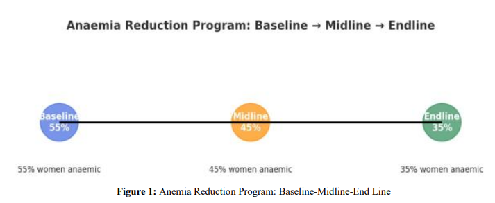
• Example in Public Health: Consider an anemia reduction program for women aged 15–49 years:
![]() Baseline: Survey shows that 55% of women are anemic before interventions begin.
Baseline: Survey shows that 55% of women are anemic before interventions begin.
![]() Midline: After two years of supplementation and awareness campaigns, anemia prevalence drops to 45%.
Midline: After two years of supplementation and awareness campaigns, anemia prevalence drops to 45%.
![]() End Line: At program completion (after 5 years), prevalence declines further to 35%
End Line: At program completion (after 5 years), prevalence declines further to 35%
This sequence clearly shows a positive impact and provides evidence that the intervention is working. Another example comes from child immunization:
![]() Baseline: Only 60% of children are fully immunized in a district.
Baseline: Only 60% of children are fully immunized in a district.
![]() Midline: After a year of intensified campaigns, coverage increases to 75%.
Midline: After a year of intensified campaigns, coverage increases to 75%.
![]() End Line: At the end of the program, coverage reaches 88%.
End Line: At the end of the program, coverage reaches 88%.
• Relevance
![]() Evidence of Change – Establishes whether observed improvements are due to the program.
Evidence of Change – Establishes whether observed improvements are due to the program.
![]() Program Adjustment – Midline allows corrective action while the program is still active.
Program Adjustment – Midline allows corrective action while the program is still active.
![]() Accountability – End line provides evidence for donors and governments on whether investments produced results.
Accountability – End line provides evidence for donors and governments on whether investments produced results.
![]() Policy Learning – By comparing baseline to end line, policymakers can understand what worked and replicate successful strategies elsewhere.
Policy Learning – By comparing baseline to end line, policymakers can understand what worked and replicate successful strategies elsewhere.
Without baselines, midlines, and end lines, evaluation risks becoming speculative and anecdotal rather than evidence-based.
|
Stage |
Definition |
Purpose |
Example (Public Health) |
|
Baseline |
Measurement before program implementation. |
Establishes the starting point for comparison. |
55% of women aged 15–49 years are anemic at program start. |
|
Midline |
Interim measurement during program. |
Tracks progress, allows course correction. |
Anemia prevalence reduced to 45% after 2 years of interventions. |
|
End Line |
Measurement at program completion. |
Assesses final impact and overall effectiveness. |
Anemia prevalence reduced further to 35% after 5 years. |
Table 4
Quantitative and Qualitative Data
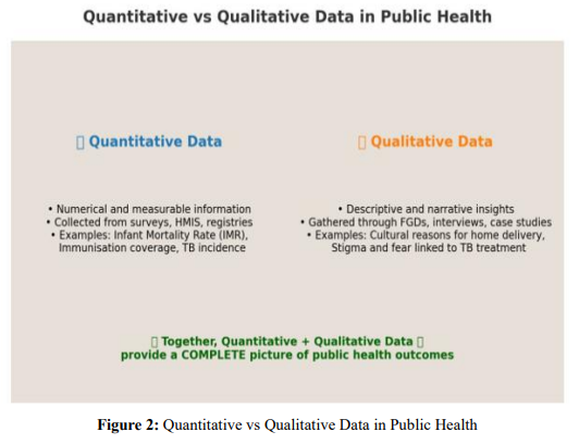
• Definition and Concept: In public health Monitoring and Evaluation (MCE), data is the foundation of evidence. Broadly, data can be classified into quantitative and qualitative.
![]() Quantitative data refers to information that is expressed in numbers. It captures counts, percentages, rates, and ratios. This type of data is objective, measurable, and can be analyzed statistically.
Quantitative data refers to information that is expressed in numbers. It captures counts, percentages, rates, and ratios. This type of data is objective, measurable, and can be analyzed statistically.
![]() Qualitative data refers to descriptive, non-numerical information that captures experiences, opinions, perceptions, and behaviors. It provides context and meaning behind the numbers.
Qualitative data refers to descriptive, non-numerical information that captures experiences, opinions, perceptions, and behaviors. It provides context and meaning behind the numbers.
Together, quantitative and qualitative data form a complementary pair, giving both the “what” and the “why” of health outcomes.
• Explanation
![]() Quantitative Data is critical for tracking coverage, disease prevalence, mortality rates, and service utilization. It is usually collected through surveys (NFHS, SRS, NSSO), routine health information systems (HMIS), and surveillance platforms (IDSP).
Quantitative Data is critical for tracking coverage, disease prevalence, mortality rates, and service utilization. It is usually collected through surveys (NFHS, SRS, NSSO), routine health information systems (HMIS), and surveillance platforms (IDSP).
![]() Qualitative Data goes beyond numbers. It helps explain why certain outcomes occur, exploring barriers, enablers, and cultural factors. It is collected through focus group discussions (FGDs), in-depth interviews (IDIs), case studies, or participatory observation.
Qualitative Data goes beyond numbers. It helps explain why certain outcomes occur, exploring barriers, enablers, and cultural factors. It is collected through focus group discussions (FGDs), in-depth interviews (IDIs), case studies, or participatory observation.
In M&E, both types of data are essential: quantitative tells us “how much change has occurred,” while qualitative tells us “why and how the change happened.”
• Example in Public Health
(i) Immunization Program
![]() Quantitative: 72% of children aged 12–23 months are fully immunized (NFHS-5).
Quantitative: 72% of children aged 12–23 months are fully immunized (NFHS-5).
![]() Qualitative: Mothers report fear of side effects and lack of trust in vaccines as reasons for not vaccinating.
Qualitative: Mothers report fear of side effects and lack of trust in vaccines as reasons for not vaccinating.
(ii) Maternal Health
![]() Quantitative: Institutional delivery rate is 85%.
Quantitative: Institutional delivery rate is 85%.
![]() Qualitative: Some women prefer home delivery due to cultural norms or experiences of mistreatment at hospitals.
Qualitative: Some women prefer home delivery due to cultural norms or experiences of mistreatment at hospitals.
(iii) Tuberculosis (TB)
![]() Quantitative: TB treatment success rate is 88%.
Quantitative: TB treatment success rate is 88%.
![]() Qualitative: Patients report stigma, job loss, and travel difficulties as challenges to completing treatment.
Qualitative: Patients report stigma, job loss, and travel difficulties as challenges to completing treatment.
• Relevance
![]() Holistic Understanding – Numbers alone cannot explain human behavior. Combining both types gives a full picture.
Holistic Understanding – Numbers alone cannot explain human behavior. Combining both types gives a full picture.
![]() Policy and Program Design – Quantitative data identifies gaps; qualitative data suggests solutions.
Policy and Program Design – Quantitative data identifies gaps; qualitative data suggests solutions.
![]() Equity and Inclusion – Qualitative data ensures voices of vulnerable groups (women, poor, rural, minorities) are captured.
Equity and Inclusion – Qualitative data ensures voices of vulnerable groups (women, poor, rural, minorities) are captured.
![]() Community Engagement – Collecting qualitative insights helps build trust between communities and health systems.
Community Engagement – Collecting qualitative insights helps build trust between communities and health systems.
![]() Accountability – Donors and governments rely on both quantitative evidence (for accountability) and qualitative evidence (for understanding context). In short, public health evaluation is strongest when quantitative and qualitative data are integrated into a mixed- methods approach.
Accountability – Donors and governments rely on both quantitative evidence (for accountability) and qualitative evidence (for understanding context). In short, public health evaluation is strongest when quantitative and qualitative data are integrated into a mixed- methods approach.
|
Aspect |
Quantitative Data |
Qualitative Data |
|
Definition |
Numerical, measurable data. |
Descriptive, non-numerical information. |
|
Nature |
Objective, standardised, generalizable. |
Subjective, detailed, context-specific. |
|
Data Sources |
Surveys (NFHS, SRS), HMIS, registries, surveillance. |
Focus groups, interviews, case studies, community observations. |
|
Examples in Public Health |
IMR, MMR, immunization coverage, TB incidence. |
Reasons for home deliveries, perceptions of vaccine safety, stigma around TB. |
|
Strengths |
Allows comparisons across populations and time; statistically robust. |
Provides depth, context, and explanations behind numbers. |
|
Limitations |
May not explain underlying reasons; risk of losing context. |
Not statistically generalizable; can be resource- intensive. |
Table 5: Comparison Table: Quantitative vs Qualitative Data in Public Health
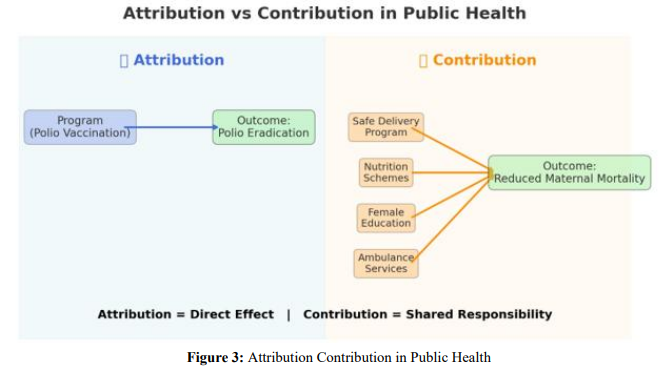
Attribution vs Contribution
• Definition and Concept: In public health evaluation, distinguishing between attribution and contribution is crucial.
![]() Attribution means directly linking a specific outcome or impact to a single intervention or program. It implies a cause-and-effect relationship where the program alone is responsible for the observed change.
Attribution means directly linking a specific outcome or impact to a single intervention or program. It implies a cause-and-effect relationship where the program alone is responsible for the observed change.
![]() Contribution recognizes that in complex systems like public health, change usually results from multiple overlapping factors. A program may not be solely responsible, but it contributes alongside other policies, interventions, and social determinants.
Contribution recognizes that in complex systems like public health, change usually results from multiple overlapping factors. A program may not be solely responsible, but it contributes alongside other policies, interventions, and social determinants.
• Explanation
![]() Attribution is easier to establish in tightly controlled interventions (e.g., vaccine campaigns, mass drug administration), where the link between action and result is clear and measurable.
Attribution is easier to establish in tightly controlled interventions (e.g., vaccine campaigns, mass drug administration), where the link between action and result is clear and measurable.
![]() Contribution is more realistic in large-scale or multi-sectoral programs, where education, nutrition, sanitation, and socioeconomic conditions also influence outcomes. In such cases, programs are one of many actors leading to change.
Contribution is more realistic in large-scale or multi-sectoral programs, where education, nutrition, sanitation, and socioeconomic conditions also influence outcomes. In such cases, programs are one of many actors leading to change.
Evaluators must be cautious: claiming attribution when many factors are at play can be misleading. Contribution analysis allows for a more honest, systems-based understanding of how health improvements occur.
• Example in Public Health
![]() Attribution Example – Polio Eradication in India: The decline to zero polio cases can be attributed to the nationwide Pulse Polio Immunization campaign. The intervention (oral polio vaccine drives) directly caused the outcome (eradication).
Attribution Example – Polio Eradication in India: The decline to zero polio cases can be attributed to the nationwide Pulse Polio Immunization campaign. The intervention (oral polio vaccine drives) directly caused the outcome (eradication).
![]() Contribution Example – Maternal Mortality Reduction: A fall in maternal mortality cannot be attributed to a single program. It is the result of multiple contributing factors: institutional delivery programs, better nutrition, improved education of women, ambulance services, and poverty reduction. Each program contributed to the change
Contribution Example – Maternal Mortality Reduction: A fall in maternal mortality cannot be attributed to a single program. It is the result of multiple contributing factors: institutional delivery programs, better nutrition, improved education of women, ambulance services, and poverty reduction. Each program contributed to the change
![]() Contribution Example – Air Pollution and Respiratory Health: Reduction in air pollution–related hospitalizations may be due to multiple contributors: government air quality controls, public health advisories, seasonal wind patterns, and medical interventions. No single program can claim sole credit.
Contribution Example – Air Pollution and Respiratory Health: Reduction in air pollution–related hospitalizations may be due to multiple contributors: government air quality controls, public health advisories, seasonal wind patterns, and medical interventions. No single program can claim sole credit.
• Relevance
![]() Accuracy – Prevents overclaiming success and recognizes the role of broader systems.
Accuracy – Prevents overclaiming success and recognizes the role of broader systems.
![]() Policy Learning – Helps policymakers understand that complex health outcomes require multi-sectoral action.
Policy Learning – Helps policymakers understand that complex health outcomes require multi-sectoral action.
![]() Donor Communication – Provides a realistic picture to funders: programs may be key contributors but rarely the only driver of change.
Donor Communication – Provides a realistic picture to funders: programs may be key contributors but rarely the only driver of change.
![]() Equity and Systems Thinking – Encourages collaboration across health, education, sanitation, and social sectors.
Equity and Systems Thinking – Encourages collaboration across health, education, sanitation, and social sectors.
![]() Strategic Planning – Attribution is suitable for pilot projects and controlled trials; contribution is better for national-level, real-world health programs.
Strategic Planning – Attribution is suitable for pilot projects and controlled trials; contribution is better for national-level, real-world health programs.
|
Aspect |
Attribution |
Contribution |
|
Definition |
Directly linking outcomes to one program/ intervention. |
Recognizing multiple factors/programs together cause outcomes. |
|
Nature |
Cause-and-effect, linear relationship. |
Multi-factorial, system-wide change. |
|
When Used |
Controlled programs with clear interventions. |
Complex, large-scale programs with overlapping determinants. |
|
Example |
Eradication of polio attributed to mass vaccination campaigns. |
Reduction in maternal mortality due to combined effect of safe delivery programs, education, and nutrition. |
|
Strengths |
Clarity, simplicity, easier accountability. |
Realistic, acknowledges complexity, fosters collaboration. |
|
Limitations |
Can overstate program effect in complex settings. |
Harder to measure exact contribution of each factor. |
Table 6: Attribution vs Contribution in Public Health
Results Chain (Bringing It Together)
• Definition and Concept: The Results Chain is a structured way of linking program resources to activities, outputs, outcomes, and impacts. It shows how health interventions move step by step from inputs (resources) to impact (long-term changes in population health). In monitoring and evaluation, the Results Chain provides a logical framework for understanding how programs are expected to produce results. It also guides what should be measured at each stage using appropriate indicators.
• Explanation: The Results Chain has five key levels:
![]() Inputs – The resources that go into a program (funding, staff, medicines, equipment).
Inputs – The resources that go into a program (funding, staff, medicines, equipment).
![]() Activities – The actions undertaken to deliver services (training health workers, immunization sessions, antenatal check-ups).
Activities – The actions undertaken to deliver services (training health workers, immunization sessions, antenatal check-ups).
![]() Outputs – The immediate products or services delivered (number of women who received ANC, number of vaccines given).
Outputs – The immediate products or services delivered (number of women who received ANC, number of vaccines given).
![]() Outcomes – The short- to medium-term changes in behaviors, practices, or coverage (increase in institutional deliveries, higher immunization coverage).
Outcomes – The short- to medium-term changes in behaviors, practices, or coverage (increase in institutional deliveries, higher immunization coverage).
![]() Impact – The long-term, sustained changes in health status (reduction in maternal mortality, decline in under-five mortality).
Impact – The long-term, sustained changes in health status (reduction in maternal mortality, decline in under-five mortality).
This chain helps programs connect daily activities with broader health goals. It ensures accountability at every level: Did resources reach the field? Were services delivered? Did people benefit? Did population health improve?
• Example in Public Health: Take the case of a maternal health program:
![]() Input: Trained nurses, blood storage facilities, and budget for safe delivery campaigns.
Input: Trained nurses, blood storage facilities, and budget for safe delivery campaigns.
![]() Activity: Conducting antenatal check-ups, health talks, and providing skilled birth attendance.
Activity: Conducting antenatal check-ups, health talks, and providing skilled birth attendance.
![]() Output: 80% of pregnant women attend at least 4 ANC visits.
Output: 80% of pregnant women attend at least 4 ANC visits.
![]() Outcome: Institutional delivery rate rises from 60% to 85% within 3 years.
Outcome: Institutional delivery rate rises from 60% to 85% within 3 years.
![]() Impact: Maternal mortality ratio (MMR) falls by 30% over 5 years.
Impact: Maternal mortality ratio (MMR) falls by 30% over 5 years.
This illustrates how each stage builds on the previous one, and how monitoring indicators at every level ensures accountability and impact measurement.
• Relevance
![]() Clarity and Accountability – Helps stakeholders see the link between resources and results.
Clarity and Accountability – Helps stakeholders see the link between resources and results.
![]() Indicator Design – Guides where to use input, process, output, outcome, or impact indicators.
Indicator Design – Guides where to use input, process, output, outcome, or impact indicators.
![]() Program Improvement – Identifies weak links (e.g., sufficient inputs but poor outcomes due to low service quality).
Program Improvement – Identifies weak links (e.g., sufficient inputs but poor outcomes due to low service quality).
![]() Donor Communication – Provides a simple framework to demonstrate program progress.
Donor Communication – Provides a simple framework to demonstrate program progress.
![]() Systems Thinking – Recognizes that impact is achieved only if the entire chain functions effectively.
Systems Thinking – Recognizes that impact is achieved only if the entire chain functions effectively.
|
Level |
Definition |
Example (Maternal Health Program) |
|
Input |
Resources invested in the program. |
Budget for safe delivery, trained nurses, blood banks. |
|
Activity |
Actions undertaken using inputs. |
Antenatal care visits, skilled birth attendance. |
|
Output |
Immediate, tangible results of activities. |
80% of women receive 4+ ANC visits. |
|
Outcome |
Short- to medium-term changes in coverage/behaviour. |
Institutional delivery rate increases from 60% → 85%. |
|
Impact |
Long-term, sustained health improvements. |
MMR reduced by 30% in 5 years. |
Table 7: Results Chain in Public Health
Frameworks for Monitoring & Evaluation
Logical Framework (Log Frame)
• Definition and Concept: The Logical Framework (Log Frame) is one of the most widely used tools in international development and public health. It is a structured matrix that links inputs, activities, outputs, outcomes, and impacts with measurable indicators, assumptions, and means of verification.
• Explanation
![]() The Log Frame is presented as a 4x4 matrix.
The Log Frame is presented as a 4x4 matrix.
![]() Columns represent objectives, indicators, means of verification, and assumptions.
Columns represent objectives, indicators, means of verification, and assumptions.
![]() Rows represent goal (impact), purpose (outcome), outputs, and activities/inputs.
Rows represent goal (impact), purpose (outcome), outputs, and activities/inputs.
![]() It provides clarity on what the project intends to achieve and how success will be measured.
It provides clarity on what the project intends to achieve and how success will be measured.
• Example in Public Health: A maternal health program Log Frame might include:
![]() Goal: Reduce maternal mortality.
Goal: Reduce maternal mortality.
![]() Purpose: Increase institutional deliveries.
Purpose: Increase institutional deliveries.
![]() Outputs: % of women receiving 4+ ANC visits.
Outputs: % of women receiving 4+ ANC visits.
![]() Activities: Train midwives, strengthen referral transport.
Activities: Train midwives, strengthen referral transport.
![]() Relevance: Log Frames help align donor requirements, track accountability, and provide a quick overview of program logic.
Relevance: Log Frames help align donor requirements, track accountability, and provide a quick overview of program logic.
Theory of Change (ToC)
• Definition and Concept: The Theory of Change is a narrative and diagrammatic approach that explains how and why a program is expected to lead to change. Unlike the rigid LogFrame, ToC is flexible and focuses on the causal pathways from inputs to outcomes, including external assumptions.
• Explanation
![]() ToC maps out the sequence of changes needed to achieve long-term impact.
ToC maps out the sequence of changes needed to achieve long-term impact.
![]() It emphasizes underlying assumptions, context, and risks.
It emphasizes underlying assumptions, context, and risks.
![]() It answers: “What must change, and in what order, for the goal to be achieved?”
It answers: “What must change, and in what order, for the goal to be achieved?”
• Example in Public Health: For an immunisation program:
![]() Parents must first understand vaccine benefits → Access to vaccine sites must improve → Service delivery must be reliable → Coverage rises → Child mortality falls.
Parents must first understand vaccine benefits → Access to vaccine sites must improve → Service delivery must be reliable → Coverage rises → Child mortality falls.
• Relevance: ToC promotes stakeholder ownership, transparency, and adaptability. It is useful for complex, multi-sectoral programs.
Results Framework
• Definition and Concept: The Results Framework is a strategic planning tool that shows how program objectives align with higher-level goals. It is often represented as a diagram with nested results linked through cause-and-effect arrows.
• Explanation
![]() Highlights intermediate results that contribute to higher-level goals.
Highlights intermediate results that contribute to higher-level goals.
![]() Focuses on accountability and performance monitoring.
Focuses on accountability and performance monitoring.
![]() Commonly used by USAID, DFID, and large global health donors.
Commonly used by USAID, DFID, and large global health donors.
• Example in Public Health
![]() Strategic Objective: Reduce TB incidence.
Strategic Objective: Reduce TB incidence.
![]() Intermediate Results: Improved case detection, better adherence support, expanded diagnostic capacity.
Intermediate Results: Improved case detection, better adherence support, expanded diagnostic capacity.
![]() Sub-results: Training lab staff, providing rapid diagnostic tools.
Sub-results: Training lab staff, providing rapid diagnostic tools.
• Relevance: Results Frameworks are ideal for large-scale, multi-year health programs with multiple partners.
WHO Health System Building Blocks
• Definition and Concept: The WHO Building Blocks framework assesses health system performance through six core components: service delivery, health workforce, information, medicines/technologies, financing, and governance.
• Explanation
![]() Provides a holistic approach to system strengthening.
Provides a holistic approach to system strengthening.
![]() Links building blocks to goals of improved health, responsiveness, financial protection, and efficiency.
Links building blocks to goals of improved health, responsiveness, financial protection, and efficiency.
• Example in Public Health: In an NCD program:
![]() Service Delivery: Screening centers at PHCs.
Service Delivery: Screening centers at PHCs.
![]() Workforce: Trained doctors and nurses.
Workforce: Trained doctors and nurses.
![]() Information: NCD registries.
Information: NCD registries.
![]() Medicines: Affordable drugs.
Medicines: Affordable drugs.
![]() Financing: Insurance schemes.
Financing: Insurance schemes.
![]() Governance: Strong regulatory frameworks.
Governance: Strong regulatory frameworks.
• Relevance: Essential for evaluating systemic capacity, not just program-specific results.
Linkages between SDGs, National Health Missions, and State Programs
• Definition and Concept: Monitoring frameworks must align with global (SDGs), national (NHM), and state-level indicators to ensure coherence and comparability.
• Explanation
![]() SDG 3: Ensure healthy lives and promote well-being for all at all ages.
SDG 3: Ensure healthy lives and promote well-being for all at all ages.
![]() National Health Mission (NHM) uses HMIS, NFHS, and SRS indicators.
National Health Mission (NHM) uses HMIS, NFHS, and SRS indicators.
![]() States adapt these into State Programme Implementation Plans (PIPs).
States adapt these into State Programme Implementation Plans (PIPs).
• Example in Public Health
![]() SDG Target 3.1: Reduce MMR.
SDG Target 3.1: Reduce MMR.
![]() NHM indicator: Institutional deliveries.
NHM indicator: Institutional deliveries.
![]() State PIP: Free transport for pregnant women.
State PIP: Free transport for pregnant women.
• Relevance: Harmonization avoids duplication, ensures ac¬countability at all levels, and allows India to report internationally.
|
Framework |
Definition |
Key Features |
Public Health Example |
Best Use |
|
LogFrame |
Matrix linking objectives, indicators, assumptions. |
Structured, rigid, 4x4 table. |
Maternal health project reducing MMR. |
Donor-funded projects. |
|
Theory of Change |
Narrative + diagram mapping causal pathways. |
Flexible, explains why/ how change happens. |
Immunization program ToC. |
Complex, multi-sectoral programs. |
|
Results Framework |
Diagram of strategic objectives and intermediate results. |
Focused on accountability and performance. |
TB reduction program. |
Large-scale multi- year programs. |
|
WHO Building Blocks |
Assesses health system through 6 blocks. |
System-level, holistic. |
NCD service delivery. |
National C system strengthening. |
|
SDG–NHM– State Linkages |
Aligns global, national, and local indicators. |
Ensures harmonization, comparability. |
SDG 3.1 ↔ NHM institutional delivery ↔ State PIP. |
Policy alignment, reporting. |
Table 8: Comparison of M&E Frameworks
|
LogFrame Matrix linking objectives s indicators |
|
Theory of Change Explains causal pathways |
|
Results Framework Strategic objectives & results |
|
WHO Building Blocks 6 health system components |
|
SDG–NHM–State Linkages Aligns global, national, local goals |
|
Aligns global, national, local goals |
Table 9: Frameworks for Monitoring & Evaluation
Sector-Specific Applications
Maternal Health
• Definition and Concept: Maternal health refers to the health of women during pregnancy, childbirth, and the postpartum period. It is not only a medical concern but also a social and developmental priority, as maternal health outcomes reflect gender equity, access to health services, and systemic capacity. Monitoring and evaluation (MCE) in maternal health involves systematic collection and analysis of data to assess whether women are receiving timely and quality care, and whether maternal mortality and morbidity are being reduced.
• Explanation: Effective MCE in maternal health requires a continuum-of-care approach, tracking women from early pregnancy through delivery and postpartum. This involves:
![]() Coverage indicators (ANC visits, institutional deliveries).
Coverage indicators (ANC visits, institutional deliveries).
![]() Quality indicators (skilled attendance, emergency obstetric care).
Quality indicators (skilled attendance, emergency obstetric care).
![]() Equity indicators (rural vs. urban, wealth quintiles, marginalized groups).
Equity indicators (rural vs. urban, wealth quintiles, marginalized groups).
![]() Evaluation can be process-oriented (availability of ANC services), outcome-oriented (rise in institutional deliveries), or impact-focused (decline in maternal mortality).
Evaluation can be process-oriented (availability of ANC services), outcome-oriented (rise in institutional deliveries), or impact-focused (decline in maternal mortality).
• Example in Public Health: In India, the Janani Suraksha Yojana (JSY) incentivises institutional deliveries. Monitoring involves tracking:
![]() Number of women completing 4+ ANC visits.
Number of women completing 4+ ANC visits.
![]() Proportion of deliveries in public and private facilities.
Proportion of deliveries in public and private facilities.
![]() Maternal Mortality Ratio (MMR) trends.
Maternal Mortality Ratio (MMR) trends.
![]() Analysis has shown that JSY improved institutional delivery rates significantly, but maternal mortality reduction was uneven due to quality of care issues.
Analysis has shown that JSY improved institutional delivery rates significantly, but maternal mortality reduction was uneven due to quality of care issues.
• Relevance: Maternal health MCE is critical because:
![]() It aligns directly with SDG 3.1 – reducing the global maternal mortality ratio to <70 per 100,000 live births by 2030.
It aligns directly with SDG 3.1 – reducing the global maternal mortality ratio to <70 per 100,000 live births by 2030.
![]() It provides insights into broader health system performance, including workforce availability, referral systems, and financial protection.
It provides insights into broader health system performance, including workforce availability, referral systems, and financial protection.
![]() It helps identify inequities – for example, higher C-section rates in urban private facilities versus lack of access in rural districts.
It helps identify inequities – for example, higher C-section rates in urban private facilities versus lack of access in rural districts.
|
Indicator |
Definition |
Numerator |
Denominator |
Formula |
|
ANC 4+ visits |
% of women with ≥4 antenatal visits |
Number of women completing 4+ ANC visits |
Total number of live births |
(ANC 4+ ÷ Live births) × 100 |
|
Institutional Delivery Rate |
% of births in health facilities |
Number of institutional deliveries |
Total number of live births |
(Institutional deliveries ÷ Live births) × 100 |
|
Maternal Mortality Ratio (MMR) |
Maternal deaths per 100,000 live births |
Number of maternal deaths |
Total number of live births |
(Maternal deaths ÷ Live births) × 100,000 |
|
Caesarean Section Rate |
% of births delivered by C- section |
Number of C- section deliveries |
Total deliveries |
(C-sections ÷ Total deliveries) × 100 |
Table 10: Reference Table: Maternal Health Indicators
Types of Evaluation in Maternal Health
• Process Evaluation: This looks at whether the system is delivering the services it promises. For example, are women receiving regular antenatal care visits? Are health facilities adequately staffed, equipped with medicines, and prepared for safe institutional deliveries?
• Outcome Evaluation: This asks whether the services are producing short-term changes. Are more women choosing institutional deliveries instead of home births? Are complications being detected and managed in time?
• Impact Evaluation: This assesses whether long-term goals are being achieved. Is the maternal mortality ratio (MMR) falling over time? Are pregnancy-related complications like eclampsia or postpartum hemorrhage decreasing?
• Cost-Effectiveness Evaluation: This examines whether resources are being used efficiently. Are investments in ambulances, free transport schemes, and maternal health insurance leading to a significant reduction in maternal deaths compared to the money spent?
How to Analyze and Interpret Maternal Health Data
• Trend Analysis: Look at year-to-year changes in ANC coverage, institutional delivery rates, and C-section rates. This shows whether progress is being made consistently.
• Equity Analysis: Compare indicators across rural and urban areas, wealth quintiles, caste or ethnic groups, and states. This helps identify whether certain populations are being left behind.
• Risk Mapping: Identify and focus on “high-risk” districts or states, often known as “high-focus states” in India, where maternal deaths remain high despite national improvements.
• Interpretation: Numbers must be understood in context. For example, if institutional deliveries are rising but MMR is not falling, it may mean that the quality of care in facilities is poor. If C-section rates rise sharply, especially in private hospitals, it may indicate unnecessary interventions rather than genuine medical need.
Excel Applications for Maternal Health M&E
• Pivot Tables: Useful for breaking down ANC coverage and delivery rates by district, state, and socioeconomic groups.
• Conditional Formatting: Automatically highlight high-risk districts (for example, those with MMR > 200 per 100,000 live births).
• Trend Graphs: Simple line or bar charts to show changes in ANC coverage and institutional delivery rates over time.
• Formulas: Can calculate ratios, averages, and year-on-year percentage changes, such as growth in institutional delivery rates.
Digitalization Applications
• HMIS (Health Management Information System): Collects facility-level data on ANC visits, institutional deliveries, and C-sections, reported monthly by states and districts.
• Mother-Child Tracking System (MCTS): A digital platform that tracks individual pregnancies, ensuring that no mother is missed in follow-up.
• Mobile Apps for ASHAs and ANMs: These apps allow frontline workers to register pregnancies, send reminders, and monitor follow-ups in real time.
• Integrated Dashboards: District- and state-level dashboards can bring together ANC, delivery, and mortality data, enabling health officials to monitor progress and take quick decisions.

Child Health
• Definition and Concept: Child health is a critical component of public health that focuses on ensuring survival, growth, development, and wellbeing of children from birth to five years of age. It encompasses immunization status, nutritional adequacy, and survival outcomes such as infant mortality rate (IMR) and under-5 mortality rate (U5MR). These indicators are globally recognized as fundamental measures of population health, reflecting the strength of maternal and child health systems.
• Explanation: Child health is measured through specific indicators: immunization coverage, which refers to the percentage of children who have received all recommended vaccines; IMR, which captures the number of infant deaths per 1,000 live births; U5MR, which estimates the probability of a child dying before completing 5 years of age; and nutrition status, assessed through anthropometric measures such as stunting, wasting, and underweight using WHO growth standards. Together, these indicators offer a comprehensive view of both preventive and curative aspects of child survival.
• Example in Public Health: For example, in India, the National Family Health Survey (NFHS-5) reports immunization coverage of around 76% for children aged 12–23 months, though coverage varies widely by state. IMR is reported at 28 per 1,000 live births (SRS 2020), and under-5 mortality stands at 32 per 1,000 live births. Nutritional challenges persist: 35% of under-5 children are stunted, 19% are wasted, and 32% are underweight. These figures highlight both progress and gaps in child health interventions, guiding programme managers to target underperforming regions.
• Relevance: The relevance of child health indicators is immense. Immunization coverage reflects access to and quality of preventive health services. Mortality indicators such as IMR and U5MR are sensitive to healthcare quality, maternal health, and socio-economic conditions. Nutritional indicators reflect not just food security but also maternal care, infection exposure, and household environment. Monitoring these parameters enables governments and international agencies to track progress toward Sustainable Development Goals (SDGs), particularly SDG 3.2, which aims to end preventable deaths of newborns and children under 5 years of age.
|
Indicator |
Definition |
Numerator |
Denominator |
Formula |
Multiplier |
Source |
|
Immunization Coverage (%) |
Percentage of children (12–23 months) who received all basic vaccinations (BCG, 3 doses of DPT/Penta, 3 doses of OPV, 1 dose of Measles/Rubella) |
No. of children 12–23 months fully immunized |
Total no. of children aged 12–23 months |
(Numerator ÷ Denominator) × 100 |
100 |
NFHS, HMIS, RCH portal |
|
Infant Mortality Rate (IMR) |
Probability of dying before age 1 per 1,000 live births |
No. of infant deaths (<1 year) |
Total no. of live births |
(Numerator ÷ Denominator) × 1,000 |
1,000 |
SRS, HMIS |
|
Under-5 Mortality Rate (U5MR) |
Probability of dying before age 5 per 1,000 live births |
No. of deaths under age 5 |
Total no. of live births |
(Numerator ÷ Denominator) × 1,000 |
1,000 |
SRS, HMIS |
|
Stunting (%) |
Height-for-age below -2 SD from WHO reference median among under-5 children |
No. of under-5 children stunted |
Total no. of under-5 children measured |
(Numerator ÷ Denominator) × 100 |
100 |
NFHS, CNNS |
|
Wasting (%) |
Weight-for- height below -2 SD from WHO reference median among under-5 children |
No. of under-5 children wasted |
Total no. of under-5 children measured |
(Numerator ÷ Denominator) × 100 |
100 |
NFHS, CNNS |
|
Underweight (%) |
Weight-for-age below -2 SD from WHO reference median among under-5 children |
No. of under-5 children underweight |
Total no. of under-5 children measured |
(Numerator ÷ Denominator) × 100 |
100 |
NFHS, CNNS |
Table 11: Child Health Indicators
Types of Evaluation
Evaluation of child health can be descriptive, analytical, or programmatic. Descriptive evaluation involves tracking immunization coverage trends, mortality rates, or nutrition prevalence over time and across geographies. Analytical evaluation uses statistical tools such as regression and survival analysis to understand determinants and associations for example, how maternal education impacts immunization status. Programmatic evaluation focuses on assessing the effectiveness of interventions such as Intensified Mission Indra Dhanush (IMI) for vaccination or Poshan Abhiyaan for nutrition.
• How to Analyze and Interpret: Analysis of child health data requires both quantitative and qualitative methods. Cohort tracking helps monitor vaccination completion and child survival in defined groups over time. Survival analysis techniques, such as Kaplan–Meier curves, are used to estimate the probability of survival up to 5 years of age. Disaggregated analysis allows comparison by gender, caste, socio-economic quintile, or rural–urban location. Interpretation should go beyond raw percentages: for example, a district may report 90% immunization coverage overall, but detailed analysis might reveal only 60% coverage in slum populations. Such insights enable equity-based interventions.
• Excel Applications: Microsoft Excel offers multiple applications for child health analysis. Growth charts can be developed using WHO standard curves, with conditional formatting to highlight stunted, wasted, or underweight children. Immunization coverage can be calculated using formulas such as = (Fully_Immunised ÷ Eligible_Children) ×100. Mortality rates can be derived by linking birth and death records with formulas like = (Deaths ÷ Live_Births) × 1000. Pivot tables help disaggregate child health indicators by district, gender, or socio-economic group. Cohort survival tables can also be created in Excel to visualize child survival trends over time.
• Digitalization Applications: India has made significant progress in digitalization of child health monitoring. The Electronic Vaccine Intelligence Network (e-VIN) is an innovative system for digitizing vaccine stocks and cold chain management, ensuring vaccines reach every child. The Reproductive and Child Health (RCH) portal tracks children from birth to 5 years for immunization, growth monitoring, and health check-ups. The Health Management Information System (HMIS) provides routine monthly data on child health indicators at the facility, district, and state level, which can be visualized on integrated dashboards. Together, these digital platforms support real-time monitoring, data-driven decision-making, and rapid response to coverage gaps.

Communicable Diseases
• Definition and Concept: Communicable diseases are illnesses caused by infectious agents such as bacteria, viruses, or parasites that can spread directly or indirectly between individuals. In public health, monitoring communicable diseases such as tuberculosis (TB), HIV/AIDS, and malaria remains a priority because of their persistent burden in India and globally. Effective surveillance, timely case detection, and successful treatment outcomes are critical for reducing morbidity, mortality, and transmission within communities.
• Explanation: The assessment of communicable diseases often focuses on key indicators that measure both burden and programmatic performance. The TB treatment success rate reflects the proportion of patients who complete therapy successfully, an important indicator for controlling drug resistance. HIV prevalence indicates the proportion of the population living with HIV at a given time, a marker of ongoing transmission and effectiveness of prevention efforts. Malaria incidence measures the number of new malaria cases within a specified period, reflecting transmission intensity and control program effectiveness. Together, these indicators provide a comprehensive view of the state of communicable diseases and the quality of intervention programs.
• Example in Public Health: For instance, India’s TB program (under the National TB Elimination Programme) reports a treatment success rate of around 80–85%, with challenges persisting in drug-resistant TB management. HIV prevalence among adults aged 15–49 years is currently estimated at 0.2–0.3%, but certain states and high-risk groups carry a disproportionate burden. Malaria incidence has sharply declined over the past decade, though northeastern states and tribal areas continue to report higher rates. These examples illustrate that while national averages show progress, localized challenges necessitate targeted interventions and robust reporting systems.
• Relevance: Monitoring communicable disease indicators is vital for achieving Sustainable Development Goals (SDG 3.3), which aim to end epidemics of AIDS, TB, malaria, and neglected tropical diseases by 2030. High treatment success rates in TB reduce transmission and drug resistance, while tracking HIV prevalence informs prevention and care policies. Malaria incidence trends guide resource allocation for vector control and treatment. Equally important is the completeness of reporting systems such as IDSP (Integrated Disease Surveillance Programme), since under-reporting can mask true disease burden and mislead policy decisions.
|
Indicator |
Definition |
Numerator |
Denominator |
Formula |
Multiplier |
Source |
|
TB Treatment Success Rate (%) |
Proportion of TB patients successfully treated among those initiated on treatment |
No. of TB patients cured or completed treatment |
Total TB patients initiated on treatment |
(Numerator ÷ Denominator) × 100 |
100 |
Nikshay, NTEP |
|
HIV Prevalence (%) |
Percentage of population living with HIV |
No. of people living with HIV (PLHIV) |
Total population (15–49 years) |
(Numerator ÷ Denominator) × 100 |
100 |
NACO, NFHS |
|
Malaria Incidence (per 1,000 population) |
No. of new malaria cases per 1,000 population at risk |
Confirmed malaria cases |
Total population at risk |
(Numerator ÷ Denominator) × 1,000 |
1,000 |
NVBDCP, IDSP |
|
Reporting Completeness (%) |
Percentage of health facilities submitting |
No. of facilities reporting |
Total no. of facilities |
(Numerator ÷ Denominator) × 100 |
100 |
IDSP, HMIS |
Table 12: Communicable Disease Indicators
Types of Evaluation
Evaluations of communicable disease programs can be operational, outcome-based, or impact-oriented. Operational evaluation examines program reach and reporting completeness, such as whether all districts are reporting TB cases into Nikshay. Outcome evaluation measures intermediate results like treatment adherence or reduction in HIV transmission. Impact evaluation looks at long¬term trends in incidence, prevalence, and mortality, using cohort analysis for TB and survival analysis for HIV patients.
• How to Analyze and Interpret Analysis
typically involves trend analysis to monitor disease patterns over time and across geographies. Cohort analysis is critical for TB, tracking treatment initiation, adherence, and outcomes. HIV data analysis includes prevalence and incidence trends across key populations and states. Malaria incidence is often mapped geographically to detect hotspots and seasonal patterns. Interpretation must highlight both absolute levels and disparities; for example, a state may have an overall TB success rate of 85%, but rates among tribal populations could be as low as 60%.
• Excel Applications
Excel can be used to develop case notification dashboards where new cases, treatment outcomes, and trends can be visualized. For TB, cohort analysis tables can be built with rows representing treatment initiation months and columns showing outcomes (cured, completed, failed, lost to follow-up). Pivot charts can highlight HIV prevalence by district or key population. Conditional formatting can flag malaria incidence above threshold levels, enabling quick hotspot detection.
• Digitalization Applications
Digital platforms have transformed communicable disease monitoring in India. The Nikshay portal is a comprehensive online system for TB case notification, treatment adherence monitoring, and cohort analysis. It supports program managers in tracking patients and ensuring continuity of care. The Integrated Disease Surveillance Programme (IDSP) portal provides weekly reporting on priority diseases, outbreaks, and epidemiological trends across districts. For HIV, the National AIDS Control Organisation (NACO) uses digital platforms for programme data capture and monitoring. Together, these digital tools strengthen disease surveillance, improve transparency, and enable rapid decision-making.

Figure 6: Digitalization
Non-Communicable Diseases (NCDs)
• Definition and Concept: Non-communicable diseases (NCDs) are chronic conditions that are not passed from person to person, such as cardiovascular diseases, cancers, chronic respiratory diseases, and diabetes. They are often linked to lifestyle, environmental, and genetic risk factors, and account for a large share of morbidity and mortality globally. Unlike communicable diseases, NCDs progress slowly and require long-term management. Screening, timely detection, and effective treatment of conditions like hypertension and diabetes are essential to reducing their burden.
• Explanation: Public health programmes measure NCD control through indicators such as the percentage of population screened for hypertension and diabetes, the proportion of patients achieving control of hypertension, and the mortality rate attributable to NCDs. Screening coverage shows the reach of preventive services, while control rates reflect treatment effectiveness. NCD mortality rate, usually expressed per 100,000 population, captures the population-level impact of risk factors, healthcare services, and health-seeking behavior.
• Example in Public Health: In India, the National Programme for Prevention and Control of Cancer, Diabetes, Cardiovascular Diseases and Stroke (NPCDCS) emphasizes mass screening of adults above 30 years for hypertension and diabetes. For example, district health teams conduct village-level screenings using digital health apps. Despite large-scale efforts, only around 50–60% of adults with hypertension are aware of their condition, and less than 20% achieve control. NCDs contribute to nearly 63% of all deaths in India, underscoring the importance of early detection and effective management.
• Relevance: The importance of NCD indicators lies in their growing contribution to the global burden of disease. Monitoring screening coverage ensures that at-risk populations are reached. Tracking hypertension and diabetes control rates helps evaluate whether health systems are preventing complications such as heart attacks, kidney failure, or blindness. Mortality rates from NCDs inform long-term planning and resource allocation for prevention, primary care, and health promotion. Globally, Sustainable Development Goal (SDG) 3.4 aims to reduce premature mortality from NCDs by one-third by 2030.
|
Indicator |
Definition |
Numerator |
Denominator |
Formula |
Multiplier |
Source |
|
% Population |
Proportion of |
No. of adults (≥30 |
Eligible adult |
(Numerator ÷ |
100 |
NPCDCS, |
|
Screened for |
eligible population |
years) screened |
population |
Denominator) |
|
NCD App |
|
Hypertension/ |
screened |
|
|
× 100 |
|
|
|
Diabetes |
|
|
|
|
|
|
|
Hypertension |
Percentage of |
No. of |
Total no. of |
(Numerator ÷ |
100 |
NPCDCS, |
|
Control Rate (%) |
hypertensive |
hypertensive |
diagnosed |
Denominator) |
|
NCD App |
|
|
patients with |
patients with BP |
hypertensive |
× 100 |
|
|
|
|
controlled BP |
<140/90 |
patients |
|
|
|
|
NCD Mortality |
No. of deaths |
No. of NCD |
Total population |
(Numerator ÷ |
100,000 |
CRS, SRS, WHO |
|
Rate |
due to NCDs per |
deaths |
|
Denominator) |
|
STEPS |
|
|
100,000 |
|
|
× 100,000 |
|
|
|
|
population |
|
|
|
|
|
Table 13: Reference Table NCD Indicators
Types of Evaluation
NCD programmes can be evaluated through risk-factor surveys (such as STEPS surveys by WHO), which measure smoking, alcohol, diet, and physical activity. Cohort tracking is another method, where individuals screened or diagnosed are followed over time to assess treatment adherence and outcomes. Programmatic evaluations assess the effectiveness of NPCDCS interventions, community health workers’ roles, and integration of NCD services into primary health care.
• How to Analyze and Interpret: Analysis of NCD indicators involves both descriptive and inferential approaches. Time-series plots are used to track trends in screening coverage or NCD mortality over several years. Regression analysis can identify associations between risk factors (such as smoking, high BMI, or unhealthy diet) and outcomes (such as mortality). Disaggregated analysis helps identify gaps for example, urban areas may show higher screening coverage but also higher obesity prevalence compared to rural areas. Interpretation should always focus on equity and access, since vulnerable groups often have lower screening and control rates.
• Excel Applications: Excel can be used to build dashboards displaying screening coverage and control rates by state or district. Time-series plots allow trend tracking of NCD mortality rates. Regression functions in Excel can be applied to datasets to link behavioral risk factors with outcomes such as diabetes prevalence. Cohort monitoring templates can track individual patients’ blood pressure or blood sugar levels over time, using conditional formatting to highlight uncontrolled cases.
• Digitalization Applications: India has advanced digital platforms for NCD management. The NCD App allows frontline health workers to screen, record, and follow-up patients with hypertension and diabetes. Population health dashboards integrate NCD screening and treatment data across states and districts, allowing programme managers to monitor progress in real time. Integration with Ayushman Bharat Health Account (ABHA) and electronic health records strengthens longitudinal tracking of patients. These digital systems enable large-scale screening, continuity of care, and policy decisions based on real-time evidence.

Figure 7: Child Health
Vector-Borne Diseases
• Definition and Concept: Vector-borne diseases are infections transmitted by vectors such as mosquitoes, sandflies, and ticks. They remain major public health concerns in tropical and subtropical regions. In India, key vector-borne diseases include malaria, dengue, chikungunya, and Japanese encephalitis. These diseases are highly sensitive to environmental factors like rainfall, temperature, and humidity, making their control dependent on both medical interventions and vector management.
• Explanation: Public health monitoring of vector-borne diseases revolves around core indicators: dengue incidence (measured as the number of confirmed dengue cases per population), malaria Annual Parasite Incidence (API, the number of confirmed malaria cases per 1,000 population at risk in a year), and case fatality rate (CFR), which shows the proportion of deaths among confirmed cases. Together, these indicators capture disease burden, transmission intensity, and effectiveness of case management.
• Example in Public Health: India has made remarkable progress in reducing malaria, with API dropping below 0.25 in many districts. However, states like Chhattisgarh, Odisha, and parts of the northeast still report higher incidence. Dengue has become endemic in most urban centers, with outbreaks occurring seasonally after monsoon rains. The CFR for vector-borne diseases has generally declined due to improved case management, but localized spikes during outbreaks still occur, as seen with severe dengue in Delhi and Kerala.
• Relevance: Vector-borne diseases significantly impact morbidity, mortality, and economic productivity. Early outbreak detection allows health systems to mount timely vector control measures such as fogging, larvicide, and community mobilization. Monitoring API informs resource allocation for malaria elimination efforts. CFR provides insights into health system performance in managing severe cases. Moreover, with climate variability increasing, vector-borne disease surveillance is crucial for anticipating seasonal surges and preventing large- scale epidemics.
|
Indicator |
Definition |
Numerator |
Denominator |
Formula |
Multiplier |
Source |
|
Dengue Incidence |
No. of confirmed dengue cases per 100,000 population |
No. of confirmed dengue cases |
Total population |
(Numerator ÷ Denominator) × 100,000 |
100,000 |
IDSP, NVBDCP |
|
Malaria API |
Annual Parasite Incidence per 1,000 population at risk |
Confirmed malaria cases in a year |
Total population at risk |
(Numerator ÷ Denominator) × 1,000 |
1,000 |
NVBDCP, IDSP |
|
Case Fatality Rate (CFR%) |
Proportion of deaths among confirmed cases |
No. of deaths due to vector- borne disease |
No. of confirmed cases |
(Numerator ÷ Denominator) × 100 |
100 |
IDSP, HMIS |
Table 14: Reference Table: Vector-Borne Disease Indicators
Types of Evaluation
Evaluations can be outbreak-focused, seasonal, or programmatic. Outbreak evaluation analyses response timeliness, laboratory confirmation, and vector control measures. Seasonal evaluation studies correlations between weather patterns (rainfall, temperature) and disease incidence. Programmatic evaluations assess the effectiveness of initiatives like the National Vector Borne Disease Control Programme (NVBDCP).
• How to Analyze and Interpret: Analysis involves trend and correlation studies. Seasonal trend analysis compares case counts month by month to detect peaks. Correlation analysis links rainfall and temperature data with disease incidence, helping predict outbreaks. Geographic Information Systems (GIS) are increasingly used to map hotspots and guide interventions. Interpretation requires distinguishing between endemic transmission and outbreak spikes; for example, consistent low-level malaria transmission may need long¬term control, while sudden dengue outbreaks demand rapid containment.
• Excel Applications: Excel enables practical tools for analyzing vector-borne disease data. Pivot tables can summaries incidence by district and overlay with rainfall or temperature datasets. Conditional formatting can highlight districts with API above elimination thresholds. CFR can be calculated quickly with built-in formulas, and charts can show seasonal peaks. Scatter plots with regression lines help visualize associations between climatic factors and incidence.
• Digitalization Applications: Digital platforms are enhancing vector-borne disease surveillance. GIS-based dashboards provide real-time maps of dengue and malaria cases, enabling hotspot identification. Mobile reporting apps allow health workers to notify suspected cases and larval indices instantly from the field. The IDSP portal integrates outbreak reporting, while NVBDCP digital systems provide malaria and dengue dashboards at state and national levels. These applications support rapid outbreak detection, resource mobilization, and effective community-level interventions.

Figure 8: Digitalization
Family Planning
• Definition and Concept: Family planning refers to the ability of individuals and couples to anticipate and attain their desired number of children and the spacing and timing of their births. It is achieved through the use of contraceptive methods and treatment of infertility. In public health, family planning programmes aim to provide access to safe, voluntary, and effective contraceptives, ensuring reproductive autonomy and reducing maternal and child mortality.
• Explanation: Key family planning indicators include the Contraceptive Prevalence Rate (CPR), which measures the proportion of women using any method of contraception, with a focus on modern methods such as pills, IUDs, injectables, and sterilization. Unmet need for family planning captures women who wish to delay or stop childbearing but are not using any method of contraception. Method-mix refers to the distribution of contraceptive users across different methods, reflecting both availability and choice in the system. These indicators are essential to assess accessibility, demand, and equity in family planning services.
• Example in Public Health: In India, NFHS-5 (2019–21) reports a CPR of 67%, with modern method use at around 56%. Female sterilizations accounts for nearly two-thirds of contraceptive use, showing limited diversity in method-mix. Unmet need has declined over time but still affects nearly 10% of currently married women, particularly among adolescents, rural women, and those with low education. These trends reveal progress but also highlight the need to expand access to reversible methods and address inequities.
• Relevance: Family planning is central to maternal and child health. By preventing unintended pregnancies, it reduces the risk of unsafe abortions and maternal mortality. Ensuring access to a range of contraceptive methods empowers women, improves child survival, and contributes to economic stability. SDG 3.7 specifically targets universal access to sexual and reproductive health services, including family planning, by 2030.
|
Indicator |
Definition |
Numerator |
Denominator |
Formula |
Multiplier |
Source |
|
Contraceptive Prevalence Rate (CPR %) |
Proportion of women of reproductive age using contraception |
No. of women (15–49) using contraception |
Total women aged 15–49 |
(Numerator ÷ Denominator) × 100 |
100 |
NFHS, HMIS |
|
Unmet Need for Family Planning (%) |
Proportion of women who wish to delay/ stop childbearing but are not using contraception |
No. of women with unmet need |
Total women aged 15–49 |
(Numerator ÷ Denominator) × 100 |
100 |
NFHS |
|
Method-Mix (%) |
Distribution of contraceptive users by method type |
Users of a given method |
Total contraceptive users |
(Numerator ÷ Denominator) × 100 |
100 |
NFHS, HMIS |
Table 15: Family Planning Indicators
Types of Evaluation
Evaluation of family planning programmes can be descriptive (trends in CPR and unmet need), equity-focused (differences across education, wealth, and geography), and programmatic (effectiveness of interventions such as FP counsellors or digital campaigns). Cohort tracking helps monitor long-term uptake and continuation of contraceptive methods.
• How to Analyze and Interpret: Analysis involves tracking CPR and unmet need over time and disaggregating by socio-economic and demographic variables. Method-mix analysis, usually with pie charts, shows reliance on one method versus diversity of options. High unmet need in specific groups (e.g., adolescents, rural poor) signals programmatic gaps. Interpretation should highlight both overall progress and inequalities in access.
• Excel Applications: Excel can be used to calculate unmet need using formulas such as: = (Women_with_Unmet_Need ÷ Total_Women_15-49) × 100 Pie charts effectively visualize method-mix across sterilizations, IUDs, injectables, condoms, and pills. Cohort trend analysis can be plotted using line graphs to show CPR changes over survey rounds.
• Digitalization Applications: India has adopted digital platforms to strengthen family planning monitoring. HMIS dashboards provide monthly district-level data on contraceptive uptake and method distribution. Mobile-based FP apps offer counselling, reminders for contraceptive use, and fertility awareness tools. Integration with the RCH portal allows tracking of individual women’s contraceptive adoption and follow-up. Together, these digital tools support program managers in identifying gaps and ensuring accountability.

Figure 9
Health Financing
• Definition and Concept: Health financing refers to the mechanisms through which resources are generated, allocated, and used in the health system. It ensures that people can access healthcare services without facing financial hardship. Effective health financing systems aim to achieve universal health coverage (UHC), where essential health services are accessible to all and out-of-pocket payments do not push families into poverty.
• Explanation: The measurement of health financing performance includes several key indicators. The proportion of households covered by health insurance reflects financial protection mechanisms. Out-of-Pocket Expenditure (OOPE) as a percentage of Total Health Expenditure (THE) shows the extent to which households directly bear healthcare costs. Utilisation of government schemes like Pradhan Mantri Jan Arogya Yojana (PM-JAY) indicates whether financial protection is reaching the poor and vulnerable. Together, these indicators demonstrate both the breadth and equity of financial risk protection in the health system.
• Example in Public Health: In India, NFHS-5 data shows that only about 41% of households report having any form of health insurance, with significant variation across states. OOPE still accounts for over 50% of THE, among the highest in the world, leading to catastrophic health expenditure for many families. PM-JAY, launched in 2018, provides coverage up to ![]() lakh per family per year for secondary and tertiary hospitalization. By 2024, the scheme had issued over 27 crore Ayushman cards and facilitated more than 5 crore hospital admissions. These examples highlight both achievements and persistent gaps in protecting households from financial risks.
lakh per family per year for secondary and tertiary hospitalization. By 2024, the scheme had issued over 27 crore Ayushman cards and facilitated more than 5 crore hospital admissions. These examples highlight both achievements and persistent gaps in protecting households from financial risks.
• Relevance: Health financing is fundamental for equity and UHC. High OOPE leads to impoverishment, pushing millions of households below the poverty line each year. Insurance coverage ensures risk pooling and access to services. Monitoring utilization of schemes like PM-JAY provides feedback on inclusiveness, quality of coverage, and geographic equity. These indicators are essential for policymakers to evaluate whether financial protection is being achieved in practice.
|
Indicator |
Definition |
Numerator |
Denominator |
Formula |
Multiplier |
Source |
|
% Households Covered by |
Proportion of households with health insurance |
No. of insured households |
Total no. of households |
(Numerator ÷ Denominator) × 100 |
100 |
NFHS, NSSO |
|
Out-of-Pocket Expenditure (OOPE) as % of THE |
Share of total health expenditure paid directly by households |
Household OOPE |
Total health expenditure (public + private) |
(Numerator ÷ Denominator) × 100 |
100 |
NHA, NSSO |
|
PM-JAY Utilization (%) |
Beneficiaries availing hospitalization services under PM-JAY |
No. of PM-JAY beneficiaries utilizing services |
Total eligible households |
(Numerator ÷ Denominator) × 100 |
100 |
PM-JAY Dashboard, MoHFW |
Table 16: Reference Table: Health Financing Indicators
Types of Evaluation Evaluations
of health financing can be financial, equity-focused, or programmatic. Financial evaluation looks at sustainability of funding and efficiency in allocation. Equity evaluation examines whether the poor are covered at the same rate as the rich, often using cross-tabulation with wealth quintiles. Programmatic evaluation measures scheme performance, such as claims processing, fraud detection, and patient satisfaction.
• How to Analyze and Interpret: Analysis of health financing involves identifying patterns of financial burden and protection. Cross-tabulations can show whether insurance coverage is higher among wealthier quintiles, indicating inequity. Calculation of catastrophic expenditure defined as household spending on health exceeding 10% of total consumption is crucial to assess vulnerability. Interpretation should consider both absolute and relative measures; for instance, even if insurance coverage expands, persistent high OOPE suggests schemes may not cover common services.
• Excel Applications: Excel can be used to calculate catastrophic expenditure thresholds using household-level data. For example, formulas can flag households where health spending exceeds 10% of monthly income. Charts can show OOPE trends across states and quintiles. Pivot tables can compare insurance coverage and PM-JAY utilization by socio-economic groups. Time-series analysis can display reductions in OOPE as reforms are implemented.
• Digitalization Applications: India’s move towards digitalization in health financing is significant. PM-JAY dashboards provide real-time information on claims, admissions, and expenditure patterns. Beneficiary databases linked to Aadhaar ensure transparency and reduce fraud. Real¬time claims data allows monitoring of scheme utilization and ensures timely reimbursement to hospitals. Integration with the National Digital Health Mission (NDHM) supports portability of benefits across states. Together, these platforms enhance accountability, reduce leakages, and support evidence-based decision-making.

Figure 10: Health Financing
Climate Change and Health
• Definition and Concept: Climate and health refer to how climate variability and long-term climate change influence patterns of disease, injury, and health-system functioning. Heat waves, altered rainfall, floods, cyclones, droughts, and degraded air quality can shift the incidence and geography of heat illness, vector-borne infections (malaria, dengue), acute respiratory infections (ARIs), water/food-borne diseases, and mental-health stressors. Climate- resilient health systems anticipate these risks and adapt infrastructure, surveillance, and service delivery to protect populations especially the poor and those living in urban slums, coastal zones, and drought-prone districts.
• Explanation: We examine both hazards (temperature, humidity, rainfall, AQI, flood/cyclone exposure) and health outcomes (heat-related illness and deaths, ARIs, malaria/ dengue, leptospirosis, diarrheal disease). Programme readiness is assessed through early-warning systems (EWS), response plans (e.g., Heat Action Plans), and facility resilience (backup power, cooling/ventilation, flood protection, safe water, biomedical waste management). Indicators therefore cover (1) disease burden tied to climate signals, (2) infrastructure and preparedness, and (3) the existence and use of EWS that translate IMD forecasts into public-health action.
• Example in Public Health: A heatwave cluster in May–June triggers an IMD alert; the district activates its Heat Action Plan: SMS advisories, extended clinic hours, ORS distribution, cooling centers, and hydration points. Hospitals log heat- stress cases via HMIS; mortality audits are fast-tracked. Simultaneously, heavy monsoon rainfall elevates container indices; entomology teams intensify larval source management in predicted hotspots, while IDSP tracks febrile cases. Weekly review compares AQI trends with ARI OPD peaks, validating the need for school advisories and clean-air rooms in facilities.
• Relevance: Climate-sensitive diseases and extreme events threaten SDG 3 (health) and SDG 13 (climate action). Early warnings that are acted upon can avert deaths, reduce surge load on emergency services, protect essential medicines and vaccines, and save costs. Measuring facility resilience and EWS coverage helps states priorities infrastructure investments and strengthen last-mile response.
|
Indicator |
Definition |
Numerator |
Denominator |
Formula |
Multiplier |
Primary Source(s) |
|
Heat- related |
Count/rate of |
No. of heat- |
Population (for |
(Cases or deaths |
100,000 |
HMIS/IDSP, |
|
illness cases and |
reported heat |
related cases/ |
rate) |
÷ Population) |
(rate) |
Facility ER logs |
|
deaths |
exhaustion/heat- |
deaths |
|
× Multiplier |
|
|
|
|
stroke and deaths |
|
|
|
|
|
|
|
during heat season |
|
|
|
|
|
|
AQI vs ARI linkage |
Strength of association between AQI (or PM2.5) and ARI OPD/IPD |
Correlation/ regression coefficient |
— |
β or r from model |
— |
CPCB/IMD AQI, HMIS/IDSP |
|
Vector- borne incidence vs weather |
Dengue/malaria incidence modeled against rainfall/ temperature with lags |
Confirmed VBD cases |
Population at risk |
(Cases ÷ Pop at risk) × 1,000 (API) |
1,000 |
NVBDCP/IDS P, IMD rainfall |
|
Climate- resilient facilities (%) |
Facilities meeting resilience checklist criteria |
Facilities scoring ≥ threshold |
Total assessed facilities |
(Numerator ÷ Denominator) × 100 |
100 |
State resilience audits, HMIS |
|
EWS existence & activation |
Districts with Heat Action Plan/ flood alert system and documented activations |
Districts with EWS and ≥1 activation this season |
Total districts |
(Numerator ÷ Denominator) × 100 |
100 |
IMD, SDMA/Health Dept. records |
Table 17: Reference Table: Climate–Health Indicators
Types of Evaluation
Process evaluation asks whether climate-adaptation measures were implemented as planned—cooling shelters opened, IEC campaigns delivered, vector control scaled with rainfall forecasts, and facility preparedness audits completed. Outcome evaluation checks whether, during intervention periods/areas, heat- stroke cases, vector-borne outbreaks, or flood-related illnesses declined relative to comparable controls. Impact evaluation examines multi-year trends to detect sustained reductions in climate-sensitive diseases after adoption of EWS and resilience upgrades.
• How to Analyze and Interpret: Use correlation and regression to link meteorological variables (daily max/min temperature, heat index, rainfall, humidity, AQI/PM2.5) with health outcomes (heat illness, ARIs, dengue/malaria). Time-series methods (decomposition, lags) reveal seasonality and delayed effects (e.g., 2–6-week lag of rainfall on dengue). Geospatial analysis overlays case clusters with rainfall anomalies, land use, and flood plains to identify hotspots. Interpretation should account for confounders (holidays, epidemics, reporting changes) and equity (urban slums, outdoor workers, elderly, children). Report absolute numbers and rates, plus exceedance days (e.g., days > IMD heatwave threshold) to connect analysis to action triggers.
• Excel Applications: Combine IMD daily weather and AQI files with IDSP/HMIS case lines using date and district keys. Compute associations with built-in functions such as =CORREL (temp_range, heat_cases_range) or =CORREL (AQI_range, ARI_OPD_range). Build seasonality with pivot tables (Rows: Month; Values: Mean cases) and create lagged columns (e.g., Rain_tminus2wk) for simple regression (Data → Data Analysis → Regression). Use conditional formatting to flag districts exceeding thresholds (e.g., API > elimination target; days with WBGT > safe limit). Create small multiples of monthly trends for quick supervisory review.
• Digitalization Applications: Integrate IMD feeds (temperature, rainfall, heat/cold wave alerts, cyclone tracks) with IDSP/HMIS to auto-populate EWS dashboards. Deploy GIS dashboards for live hotspot mapping and route optimization for field teams. Use AI/ML models to predict outbreaks from rainfall/temperature forecasts and entomological indices, with alerts pushed to WhatsApp/SMS. Enable mobile apps for community and ASHA reporting of heat stress, waterlogging, vector breeding, and facility damages, with photos and geotags. Ensure facility-level climate- resilience checklists (power backup, ventilation, water, waste, flood safety) are digitized and auto-scored.

Figure 11: Climate Changed and Health
Disability Indicators
• Definition and Concept: Disability refers to long-term physical, sensory, intellectual, or mental impairments that, in interaction with environmental and social barriers, restrict an individual’s participation in society. In public health, disability is not only a health condition but also a measure of social inclusion, equity, and system responsiveness. Disability indicators assess both the prevalence of functional limitations and the effectiveness of social and health systems in addressing the needs of people with disabilities.
• Explanation: Monitoring disability involves tracking prevalence (overall, by gender, and by rural–urban location), types of disabilities (locomotor, visual, hearing, speech, mental illness, intellectual disability, and multiple disabilities), and service coverage (rehabilitation, assistive devices, access to health facilities). These indicators help identify gaps in both health and social sectors, including accessibility of infrastructure, health insurance coverage, and social protection schemes for disabled populations.
• Example in Public Health: According to the Census of India 2011, about 2.2% of the population lives with disability, though estimates are higher when functional limitations (measured by surveys such as NSSO or WHO’s ICF framework) are considered. Rural prevalence is often higher due to unsafe working conditions and limited healthcare access. Women and elderly individuals are more likely to face compounded challenges such as reduced mobility, poor access to assistive devices, and economic dependence. For instance, the Rights of Persons with Disabilities (RPWD) Act, 2016 expanded recognized disability categories from 7 to 21, but many still remain under- identified in surveys.
• Relevance: Disability indicators are critical for planning inclusive health systems. Tracking prevalence by gender, age, and region helps policymakers allocate resources for rehabilitation and accessible infrastructure. Disability also intersects with SDG 3 (Good Health), SDG 4 (Education), SDG 8 (Decent Work), and SDG 10 (Reduced Inequalities). Without systematic measurement, people with disabilities risk being excluded from essential services and financial protection schemes.
|
Male Disability Prevalence (%) |
Definition |
Numerator |
Denominator |
Formula |
Multiplier |
Source |
|
Overall Disability Prevalence (%) |
Proportion of population with any disability |
No. of persons reporting disability |
Total population |
(Numerator ÷ Denominator) × 100 |
100 |
Census, NSSO, NFHS |
|
Male Disability Prevalence (%) |
Proportion of males with disability |
No. of males reporting disability |
Total male population |
(Numerator ÷ Denominator) × 100 |
100 |
Census, NSSO |
|
Female Disability Prevalence (%) |
Proportion of females with disability |
No. of females reporting disability |
Total female population |
(Numerator ÷ Denominator) × 100 |
100 |
Census, NSSO |
|
Rural Disability Prevalence (%) |
Disability prevalence in rural areas |
Persons with disability in rural areas |
Rural population |
(Numerator ÷ Denominator) × 100 |
100 |
Census, NSSO |
|
Urban Disability Prevalence (%) |
Disability prevalence in urban areas |
Persons with disability in urban areas |
Urban population |
(Numerator ÷ Denominator) × 100 |
100 |
Census, NSSO |
|
Type-specific Disability (%) |
Distribution by type (locomotor, visual, hearing, speech, mental, multiple) |
Persons with given disability type |
Total persons with disability |
(Numerator ÷ Denominator) × 100 |
100 |
Census, NSSO, RPWD data |
Table 18: Reference Table: Disability Indicators
Evaluation Approaches
Evaluation can be descriptive (mapping disability prevalence and types), outcome-based (assessing access to health services, school enrolment, or employment rates), and impact-oriented (long-term improvements in quality of life and reduction in discrimination). Evaluations also examine the implementation of legal frameworks such as the RPWD Act and accessibility norms.
• How to Analyze and Interpret: Analysis can be stratified by type of disability, gender, and location (rural vs. urban). Trend analysis helps identify whether disability prevalence is increasing due to aging populations and better detection or declining due to improved preventive care. Correlation studies can link disability prevalence with poverty, education, or employment outcomes. Interpretation should emphasize both prevalence and lived experiences—higher detection may reflect improved surveys rather than worsening health.
• Excel Applications: Excel can be used to construct prevalence tables by gender, age group, and region. Pivot tables can generate state-wise disability breakdowns by type (locomotor, visual, etc.). Conditional formatting can highlight districts with higher than average disability prevalence. Charts (bar graphs, stacked columns, pie charts) help visualize the distribution of disability types.
• Digitalization Applications: Digital innovations are improving disability data and services. The Swavlamban and UDID (Unique Disability ID) portals allow digital registration and certification of disability. HMIS and NFHS can integrate modules for disability indicators. GIS dashboards help visualize district-level prevalence and service availability. Mobile apps support reporting, service linkage, and accessibility audits. Digitalization ensures greater visibility and inclusion of persons with disabilities in mainstream health and welfare programmes.

Figure 12: Disability Indicators
Methods of Data Collection & Analysis
• Definition and Concept: Monitoring and Evaluation (M&E) in public health relies on systematic methods of data collection and analysis to generate reliable, timely, and actionable evidence. Data collection involves gathering quantitative and qualitative information through structured surveys, routine health information systems, surveillance platforms, and participatory techniques. Analysis converts raw data into meaningful insights, enabling policymakers to track progress, evaluate programme effectiveness, and adjust strategies. A strong M&E system combines different methods quantitative and qualitative, routine and ad-hoc ensuring both breadth and depth of information.
• Surveys (NFHS, DLHS, NSSO): Nationally representative household surveys form the backbone of demographic and health statistics in India. The National Family Health Survey (NFHS) provides rich data on fertility, family planning, maternal and child health, nutrition, and gender-based indicators. The District Level Household Survey (DLHS) historically provided district-level data for programme planning. The National Sample Survey Office (NSSO) generates periodic estimates on health utilization, morbidity, and expenditure. These surveys use stratified multi-stage sampling, large sample sizes, and standardized questionnaires, ensuring comparability across states and over time. While invaluable for policy planning, they are resource-intensive and periodic (every 5–10 years), limiting their use for real¬time decision-making.
• Routine HMIS Data: The Health Management Information System (HMIS) collects monthly service delivery data from health facilities across India. Indicators include ANC coverage, immunization sessions, institutional deliveries, and disease notifications. HMIS offers near-real-time insights, but data quality challenges exist due to incomplete reporting, under-reporting, and denominator mismatches. However, its routine nature makes HMIS indispensable for monitoring trends, district comparisons, and identifying programme bottlenecks. Continuous data quality audits, feedback loops, and digital dashboards are essential to improve HMIS reliability.
• Sentinel Surveillance: Sentinel sites select hospitals or labs that collect high-quality, detailed data on specific conditions help monitor trends and detect outbreaks. For example, Integrated Disease Surveillance Programme (IDSP) tracks epidemic-prone diseases, while sentinel labs monitor antimicrobial resistance or influenza-like illness. Sentinel data, though not nationally representative, provide early warning signals and can validate routine HMIS or survey data. The main strength lies in its timeliness and clinical accuracy, though coverage is limited to selected sites.
Qualitative Methods (FGDs, IDIs)
Quantitative data reveal “what” is happening, but qualitative methods explain “why.”
![]() Focus Group Discussions (FGDs) gather community perceptions, beliefs, and experiences, while In-Depth Interviews (IDIs) capture narratives from key stakeholders (e.g., health workers, policymakers, patients). These methods explore barriers to service use, social norms, and programmatic gaps that numbers alone cannot capture. For instance, FGDs with adolescent girls can reveal stigma around contraceptive use that explains high unmet need, even when services are available.
Focus Group Discussions (FGDs) gather community perceptions, beliefs, and experiences, while In-Depth Interviews (IDIs) capture narratives from key stakeholders (e.g., health workers, policymakers, patients). These methods explore barriers to service use, social norms, and programmatic gaps that numbers alone cannot capture. For instance, FGDs with adolescent girls can reveal stigma around contraceptive use that explains high unmet need, even when services are available.
![]() Mixed-Methods Evaluations: Mixed-methods combine quantitative surveys or HMIS data with qualitative insights, creating a more holistic evaluation. For example, an evaluation of TB treatment success rates may pair routine Nikshay data with FGDs among patients to understand adherence barriers. This integration allows for triangulation validating findings across sources and enhances policy relevance by combining statistics with lived experiences.
Mixed-Methods Evaluations: Mixed-methods combine quantitative surveys or HMIS data with qualitative insights, creating a more holistic evaluation. For example, an evaluation of TB treatment success rates may pair routine Nikshay data with FGDs among patients to understand adherence barriers. This integration allows for triangulation validating findings across sources and enhances policy relevance by combining statistics with lived experiences.
![]() Relevance: The use of multiple data collection methods ensures that monitoring and evaluation captures the full picture of health systems performance. Surveys provide national and state-level benchmarks, HMIS ensures continuous tracking, sentinel surveillance acts as an early warning system, and qualitative and mixed-methods approaches provide depth and context. This combination supports evidence-based policymaking, ensuring programmes remain responsive and adaptive.
Relevance: The use of multiple data collection methods ensures that monitoring and evaluation captures the full picture of health systems performance. Surveys provide national and state-level benchmarks, HMIS ensures continuous tracking, sentinel surveillance acts as an early warning system, and qualitative and mixed-methods approaches provide depth and context. This combination supports evidence-based policymaking, ensuring programmes remain responsive and adaptive.
![]() Evaluation Approaches
Evaluation Approaches
• Process Evaluation: Examines whether data collection systems are functioning (e.g., completeness of HMIS reporting, survey sampling quality).
• Outcome Evaluation: Uses survey/HMIS data to assess whether coverage and service utilization targets are being met.
• Impact Evaluation: Employs mixed-methods to assess long¬term effects of interventions, often using statistical modelling (e.g., regression, difference-in-differences).
![]() How to Analyse and Interpret
How to Analyse and Interpret
• Quantitative analysis involves descriptive statistics (coverage %, prevalence rates), inferential tests (chi- square, regression), and time-series analysis for trends.
• Qualitative analysis uses thematic coding and narrative synthesis.
• Triangulation compares findings from surveys, HMIS, and qualitative sources to identify consistencies or discrepancies. Interpretation requires awareness of data limitations such as recall bias in surveys or under-reporting in routine data.
![]() Excel Applications: Excel is a versatile tool for analyzing different data sources.
Excel Applications: Excel is a versatile tool for analyzing different data sources.
• Survey Data: Create frequency tables, calculate weighted percentages, and disaggregate by demographic groups.
• HMIS Data: Use pivot tables to generate monthly/district-wise comparisons.
• Sentinel Data: Apply trend lines and moving averages to detect outbreaks.
• Qualitative Data: While coding is best done in NVivo/Atlas. ti, Excel can organize transcripts, themes, and frequencies.
• Mixed-Methods: Integrate numeric data with thematic notes in dashboards for comprehensive reporting.
![]() Digitalization Applications: Digital platforms strengthen data collection and analysis.
Digitalization Applications: Digital platforms strengthen data collection and analysis.
• Survey Integration: NFHS and NSSO now use digital devices (CAPI – Computer-Assisted Personal Interviewing).
• HMIS: Real-time dashboards linked to state and district portals.
• IDSP: Web-enabled reporting with GIS mapping.
• Mobile Apps: Community workers use digital tools for ANC tracking, immunization, and outbreak reporting.
• AI and Machine Learning: Emerging applications for analyzing big health data, detecting anomalies, and forecasting disease trends.
|
Method |
Definition |
Strengths |
Limitations |
Examples |
|
Surveys (NFHS, DLHS, NSSO) |
Large-scale, representative household surveys |
Reliable, comprehensive, standardized |
Expensive, infrequent |
NFHS-5, NSSO Health Surveys |
|
Routine HMIS |
Continuous facility-based reporting of health services |
Near real-time, broad coverage |
Data quality issues, under-reporting |
HMIS portal, RCH portal |
|
Sentinel Surveillance |
High-quality data from selected sites |
Timely, clinically validated |
Not representative, limited scope |
IDSP, ICMR labs |
|
Qualitative Methods |
FGDs, IDIs capturing perceptions and behaviors |
Rich, contextual insights |
Small samples, subjective |
FGDs with ASHAs, IDIs with TB patients |
|
Mixed-Methods |
Combining quantitative and qualitative data |
Holistic, triangulated evidence |
Resource-intensive |
TB adherence evaluations |
Table 19: Reference Table: Methods of Data Collection & Analysis
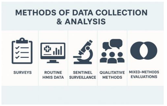
Figure 13: Methods of Data Collection &Analysis
Using Excel in Monitoring & Evaluation (M&E)
• Definition and Concept: Microsoft Excel is one of the most widely used tools for data management, analysis, and visualization in Monitoring & Evaluation. While advanced statistical software exists, Excel remains popular because of its Page 4G of 5G accessibility, user-friendliness, and versatility. In public health M&E, Excel helps transform raw survey or routine data into meaningful insights, generate indicators, monitor programme performance, and communicate findings through charts and dashboards.
• Explanation: Excel allows M&E professionals to perform basic to advanced calculations using formulas, summaries datasets through pivot tables, visualize patterns using charts, and highlight performance gaps using conditional formatting. More advanced features such as slicers, dynamic dashboards, and data analysis add- ins make Excel a powerful companion for programme managers, especially in resource-limited settings where dedicated statistical software may not be available.
• Example in Public Health: Consider routine HMIS data on institutional deliveries across districts. Using Excel, programme managers can calculate percentages of institutional vs. home deliveries, disaggregate results by rural–urban areas, and generate bar charts to show coverage gaps. Conditional formatting can quickly highlight districts falling below national targets. Dashboards can combine indicators such as ANC coverage, immunization, and maternal mortality to provide an integrated view of maternal health programme performance.
• Relevance: Excel’s relevance lies in bridging raw data and policy decisions. It empowers health officials at district and state levels, who may not be trained in advanced analytics, to still produce reliable M&E outputs. Excel tools also facilitate transparency, as data can be easily shared and understood across different levels of the health system.
Evaluation Approaches
In Excel-based MCE, evaluation can be performed through:
• Process Evaluation: Checking data completeness and consistency using COUNTIF or data validation.
• Outcome Evaluation: Calculating key coverage indicators with formulas such as PERCENTAGE.
• Impact Evaluation: Using time-series analysis or regression functions to assess programme outcomes over years.
• How to Analyse and Interpret: Analysis in Excel should always start with data cleaning—removing duplicates, checking missing values, and ensuring standardised formats. Once clean, data can be summarized through pivot tables to disaggregate by sex, age, or district. Charts such as line graphs display trends over time, while bar graphs compare coverage levels. Interpretation should go beyond numbers for instance, low immunization coverage in one district may reflect service delivery gaps or demand-side barriers.
Excel Applications
• Basic Formulas: Functions like =AVERAGE (range), =SUM (range), =IF (condition, value_if_true, value_if_false), and =COUNTIF (range, criteria) are essential for calculating averages, totals, conditional outcomes, and frequency counts.
• Pivot Tables: Enable quick cross-tabulations, e.g., immunization coverage disaggregated by gender or district.
• Charts: Line graphs reveal temporal trends, while bar graphs highlight coverage levels across groups. Pie charts are useful for method-mix in family planning.
• Conditional Formatting: Automatically highlights poor-performing districts (e.g., ANC coverage < 60%).
• Dashboards: Integrate pivot charts, slicers, and formatted tables into a single page for decision-making. Dashboards help policymakers visualize multiple indicators at once.
• Digitalization Applications: Excel is increasingly integrated into larger digital ecosystems. District dashboards are often first built in Excel before being scaled to platforms such as Power BI or Tableau. Excel templates feed into HMIS reporting systems, ensuring data compatibility. Automated data pipelines can export HMIS or survey datasets into Excel for quick field-level analysis. Thus, Excel remains both a standalone and an integrated digital tool in modern M&E.
|
Tool/Function |
Purpose in M&E |
Example Application |
|
AVERAGE, SUM, PERCENTAGE |
Calculate coverage indicators |
% ANC coverage = (ANC visits ÷ Eligible women) × 100 |
|
IF, COUNTIF |
Apply conditional checks |
Flag districts with <50% immunization |
|
Pivot Tables |
Disaggregate by sex, age, district |
Immunization coverage by gender and state |
|
Charts (line, bar, pie) |
Visualize trends and comparisons |
Line graph for U5MR trends; Pie chart for contraceptive method-mix |
|
Conditional Formatting |
Highlight thresholds |
Red highlight for districts < national average |
|
Dashboards |
Combine visuals and data |
Maternal health dashboard with ANC, delivery, and mortality |
Table 20: Reference Table: Excel Tools for M&E

Figure 14: Using Excel in M&E
Digitalization and Innovations in M&E
• Definition and Concept: Digitalization refers to the integration of digital technologies such as e-health platforms, mobile health (m- health) applications, artificial intelligence (AI), and big data systems into monitoring and evaluation. Innovations in digital health transform how data are collected, stored, analyzed, and used. Unlike traditional MCE, which often relied on paper records and delayed reporting, digital systems enable near real-time monitoring, improved data accuracy, and predictive insights.
• Explanation: Digital tools extend across the MCE cycle: frontline workers record data on tablets or mobile phones, managers review dashboards with automated analytics, and policymakers receive early warnings of outbreaks through predictive models. e-Health platforms integrate facility-level information, m-Health applications reach communities for data collection and reminders, AI processes large datasets for anomaly detection and forecasting, and big data allows linking health with non-health domains such as climate or mobility patterns.
• Example in Public Health: In India, Nikshay is a digital case-based reporting platform for tuberculosis that tracks patients from diagnosis to treatment outcome, ensuring accountability and drug adherence monitoring. eVIN (Electronic Vaccine Intelligence Network) digitizes vaccine logistics and cold chain management, reducing stockouts and wastage. The Integrated Disease Surveillance Programme (IDSP) uses web-based portals for weekly outbreak reporting. During the COVID-19 pandemic, digital dashboards (CoWIN, Aarogya Setu) enabled real- time vaccination tracking and mobility surveillance. These examples highlight how digitalization strengthens transparency and responsiveness.
• Relevance: Digitalization addresses core challenges of MCE delayed reporting, incomplete coverage, and lack of integration across programmes. By linking health data with other sectors (meteorology, environment, social protection), it supports “One Health” monitoring of climate-sensitive diseases and zoonotic threats. Digital innovations also democratize data: communities and civil society can access open dashboards, improving accountability. However, challenges of interoperability, data privacy, and capacity building remain.
Evaluation Approaches
Digital innovations can be evaluated at three levels:
• Process Evaluation: Assess whether systems are functional (e.g., % of facilities reporting via eVIN).
• Outcome Evaluation: Determine improvements in timeliness, completeness, and accuracy of reporting.
• Impact Evaluation: Analyse whether digitalization led to better health outcomes (e.g., reduced TB treatment default rates due to Nikshay).
• How to Analyse and Interpret: Analysis of digital systems involves reviewing coverage, usage, and effectiveness. For instance, dashboard analytics can show real-time reporting compliance across districts. AI-based analysis can detect correlations between rainfall and dengue outbreaks, offering predictive insights. Interpretation must also consider risks: digital divides may exclude remote populations, and high reporting may reflect improved coverage rather than actual disease increase.
• Excel Applications: Even within digital ecosystems, Excel remains relevant. Data from digital portals (Nikshay, eVIN, IDSP) are often exported to Excel for quick analysis. Excel is useful for validation checks, secondary analysis, and customized charts. Pivot tables can track reporting compliance, while regression functions can test associations between weather data and case counts exported from digital dashboards.
• Digitalization Applications: Key digital platforms in India illustrate the role of technology in M&E:
![]() Nikshay (TB): Tracks patients across the cascade from notification to treatment success.
Nikshay (TB): Tracks patients across the cascade from notification to treatment success.
![]() eVIN (Vaccines): Digitises stock and cold chain monitoring.
eVIN (Vaccines): Digitises stock and cold chain monitoring.
![]() IDSP (Disease Surveillance): Provides web-based outbreak reporting and GIS mapping.
IDSP (Disease Surveillance): Provides web-based outbreak reporting and GIS mapping.
![]() Big Data Integration: Linking HMIS with IMD weather data for predicting climate-sensitive diseases.
Big Data Integration: Linking HMIS with IMD weather data for predicting climate-sensitive diseases.
![]() AI and Machine Learning: Forecasting outbreaks, flagging anomalies in reporting.
AI and Machine Learning: Forecasting outbreaks, flagging anomalies in reporting.
![]() Mobile Apps: Community reporting, patient adherence reminders, and participatory monitoring.
Mobile Apps: Community reporting, patient adherence reminders, and participatory monitoring.
|
Innovation |
Function |
Strengths |
Challenges |
Examples |
|
e-Health Platforms |
Facility-level digital reporting and dashboards |
Real-time, integrated |
Requires infrastructure, training |
HMIS, RCH portal |
|
m-Health Apps |
Mobile-based data collection and reminders |
Community-level reach |
Limited by digital literacy, network |
ASHA apps, Aarogya Setu |
|
AI s ML |
Predictive analytics and anomaly detection |
Forecasts, early warning |
Requires data quality, privacy safeguards |
Dengue outbreak prediction models |
|
Big Data |
Linking cross-sector datasets |
Comprehensive, innovative |
Interoperability, standardization |
Linking IMD rainfall with IDSP |
|
Specialized Systems |
Programme-specific tracking |
Targeted improvements |
Fragmentation across programmes |
Nikshay, eVIN, IDSP |
Table 21: Reference Table: Digitalization s Innovations in M&E
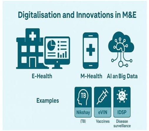
Figure 15: Digitalization and Innovations in M&E
Interpretation and Use of Findings
• Definition and Concept: Interpretation is the process of turning monitoring and evaluation (MCE) results into meaningful insights. While data collection and analysis produce numbers and trends, interpretation ensures those findings are contextualized, compared with benchmarks, and understood in ways that guide decision-making. The use of findings refers to translating these interpreted results into actionable recommendations, policy changes, and community-level communication. Without interpretation and use, MCE remains a technical exercise with little real-world impact.
• Explanation: Interpreting findings requires comparing results with targets, historical trends, and benchmarks. For example, a maternal mortality ratio (MMR) of 150 per 100,000 live births may appear encouraging, but interpretation requires understanding whether this reflects improvement from previous years, whether it meets global or national targets, and whether declines are equitable across socio-economic groups. Use of findings requires tailoring results for different audiences’ policymakers may need succinct dashboards and policy briefs, while communities may require simple visual aids in local languages.
• Example in Public Health: During NFHS reporting, states often find district-level immunization coverage below the national average. Interpreting this requires identifying reasons poor outreach, supply-side gaps, or vaccine hesitancy. Findings are then used by policymakers to reallocate resources, by programme managers to strengthen cold-chain logistics, and by civil society organizations to build awareness campaigns. Similarly, outbreak surveillance results from IDSP are interpreted to detect early warning signals and used for rapid field response.
• Relevance: The relevance of interpretation and use lies in bridging the gap between data and action. MCE systems often suffer from “data-rich but information-poor” outcomes, where large datasets are generated but not effectively used. By ensuring findings are well interpreted and communicated, MCE directly supports evidence-based policymaking, resource optimization, accountability, and community empowerment.
• Evaluation Approaches: The use of findings can be evaluated by examining:
![]() Process: Were reports, dashboards, and briefs produced on time and disseminated?
Process: Were reports, dashboards, and briefs produced on time and disseminated?
![]() Outcome: Did decision-makers actually use the evidence (e.g., revising guidelines, reallocating funds)?
Outcome: Did decision-makers actually use the evidence (e.g., revising guidelines, reallocating funds)?
![]() Impact: Did actions based on findings lead to measurable improvements (e.g., reduced disease incidence after a targeted intervention)?
Impact: Did actions based on findings lead to measurable improvements (e.g., reduced disease incidence after a targeted intervention)?
• How to Analyse and Interpret
![]() Compare indicators with baselines, national averages, and targets.
Compare indicators with baselines, national averages, and targets.
![]() Disaggregate data by sex, age, wealth quintile, or geography to identify inequalities.
Disaggregate data by sex, age, wealth quintile, or geography to identify inequalities.
![]() Look for trends rather than single-point estimates to understand direction of change.
Look for trends rather than single-point estimates to understand direction of change.
![]() Use triangulation—cross-check results with other sources (surveys vs. HMIS).
Use triangulation—cross-check results with other sources (surveys vs. HMIS).
![]() Contextualize—acknowledge limitations, such as under-reporting or seasonal variation, before drawing conclusions.
Contextualize—acknowledge limitations, such as under-reporting or seasonal variation, before drawing conclusions.
• Excel Applications: Excel plays a role in visualizing findings for interpretation. Dashboards can be developed with trend lines, color-coded targets, and heat maps for geographic comparisons. Conditional formatting can highlight areas performing below benchmarks. Pivot tables help disaggregate findings by district or gender, aiding nuanced interpretation.
• Digitalization Applications: Digital dashboards like HMIS, IDSP, and PM-JAY platforms facilitate instant interpretation by visualizing results for policymakers. Policy briefs can be generated from integrated dashboards. GIS-based tools present geographic hotspots of disease burden. Community-level mobile apps can disseminate results in simple language and visuals, ensuring findings are not confined to policymakers but reach the public.
|
Step |
Definition |
Application in M&E |
Example |
|
Interpretation |
Turning results into meaningful insights |
Comparing with benchmarks, disaggregating |
Identifying high maternal mortality districts |
|
Use by Policymakers |
Applying findings to guide decisions |
Policy briefs, dashboards |
Reallocating health funds based on NFHS coverage gaps |
|
Use by Programme Managers |
Operational application of results |
Planning outreach, re-training staff |
Intensified immunisation drives |
|
Use by Communities |
Sharing findings for awareness |
IEC campaigns, local dashboards |
Informing communities of AQI-health risks |
|
Feedback Loop |
Continuous learning |
Results inform next cycle of planning |
Adjusting FP strategy after unmet need analysis |
Table 22: Reference Table: Interpretation & Use of Findings

Figure 16: Interpretation and Use of Findings
Conclusion
• Definition and Concept: The conclusion of a Monitoring and Evaluation (MCE) framework summarizes the key lessons, emphasizes the importance of moving from data collection to effective data use, and highlights future directions for strengthening systems. It brings together the various threads of methods, tools, and innovations to show how MCE can directly improve health outcomes and policymaking.
• Explanation: Robust MCE is not just about gathering numbers—it is about ensuring that data inform decisions, guide resources, and improve accountability. As health systems evolve, so must MCE, moving beyond paper registers and delayed surveys to integrated, real-time dashboards and predictive models. The future lies in adaptive systems that can anticipate challenges like pandemics, climate change, and demographic transitions, and guide rapid, evidence-based responses.
• Example in Public Health: During the COVID-19 pandemic, India’s MCE capacity was tested. While HMIS and IDSP provided baseline surveillance, rapid digital innovations like the CoWIN vaccination platform showed how integrated dashboards could scale nationally in real time. Similarly, IMD-health collaborations for heatwave preparedness demonstrate the importance of linking climate and health data. These examples illustrate that a shift from reactive to proactive, predictive MCE is essential.
• Relevance: Conclusion emphasizes that strong MCE systems are the backbone of Universal Health Coverage (UHC), Sustainable Development Goals (SDGs), and national health priorities. Investing in MCE ensures accountability, equity, and resilience. As digital health expands, safeguarding data privacy, ensuring interoperability, and building capacity at all levels remain vital.
• Evaluation Approaches: Final evaluations of MCE systems often highlight progress on three fronts:
![]() Process: Are systems digitized, timely, and integrated?
Process: Are systems digitized, timely, and integrated?
![]() Outcome: Is data used by policymakers, managers, and communities?
Outcome: Is data used by policymakers, managers, and communities?
![]() Impact: Has evidence-based decision-making improved health outcomes?
Impact: Has evidence-based decision-making improved health outcomes?
• How to Annalise and Interpret: The conclusion of an MCE report must synthesize all results, highlight successes, and honestly acknowledge bottlenecks. Interpretation should be forward-looking, asking: How can M&E evolve further? What gaps remain in integration, capacity, or equity? This reflective analysis ensures MCE does not end at reporting but drives continuous improvement.
• Excel Applications: Excel’s role in conclusion sections often lies in summarizing large datasets into concise visuals tables of key indicators, line graphs showing improvements, and dashboards that compare baseline vs. end line results. These visuals make evidence more compelling for decision-makers
• Digitalization Applications: The future of MCE lies in integrated digital ecosystems. AI-enabled models can forecast outbreaks. Climate– health dashboards link IMD rainfall data with IDSP surveillance. One Health approaches integrate human, animal, and environmental data. Cloud-based systems make results accessible across levels in real time. The conclusion is clear: MCE must evolve from siloed data collection to integrated, predictive, and action-oriented systems [1-30].
|
Theme |
Key Message |
Future Direction |
|
Need for Robust M&E |
Data must be reliable, timely, and comprehensive |
Strengthen quality checks, validation |
|
Shift from Data to Use |
Data should drive decisions, not just reports |
Encourage dashboards, policy briefs |
|
Digital Transformation |
E-health, m-health, AI, big data reshaping MCE |
Scale integration, interoperability |
|
Equity’s Accountability |
Ensure findings reach all stakeholders |
Community dashboards, public dissemination |
|
Future Vision |
One Health and predictive MCE |
AI-driven, climate-linked, global standards |
Table 23: Summary Table: Conclusion Themes
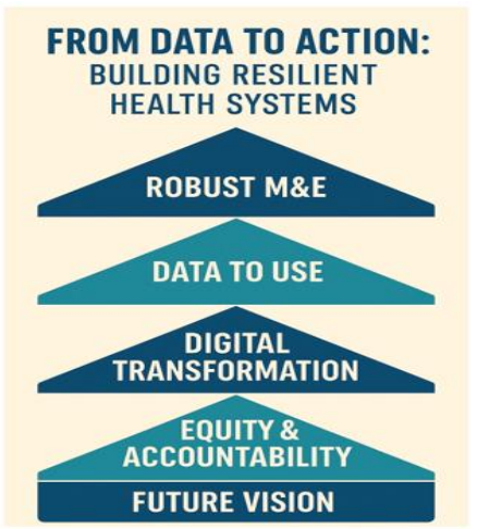
Figure 17: From Data to Action
References
- World Health Organization (WHO). Monitoring and Evaluation of Health Systems: Strengthening the Use of Evidence for Decision-Making. WHO, Geneva, 2010.
- World Health Organization. Results-Based Management Framework. WHO, Geneva.
- UNICEF. Monitoring and Evaluation Framework for Health Programmes. UNICEF, New York, 2018.
- World Bank. Designing and Using Monitoring and Evaluation Systems. World Bank Publications, Washington DC, 2012.
- OECD Development Assistance Committee. (2019). Better criteria for better evaluation: revised evaluation criteria definitions and principles for use. Paris: Organisation for Economic Co-operation and Development.
- Government of India, Ministry of Health and Family Welfare (MoHFW). Health Management Information System (HMIS) Portal – User Manuals and Reports.
- Government of India, MoHFW. National Family Health Survey (NFHS-5), 201S–21. International Institute for Population Sciences (IIPS), Mumbai.
- Office of the Registrar General s Census Commissioner, India. Sample Registration System (SRS) Statistical Report. Various years.
- National Health Systems Resource Centre (NHSRC). Monitoring & Evaluation Framework under National Health Mission (NHM). New Delhi.
- World Health Organization s UNICEF. WHO–UNICEF Estimates of Child Mortality (IGME).
- National TB Elimination Programme (NTEP), Government of India. Nikshay Programme Guidelines and Annual Reports.
- National AIDS Control Organisation (NACO). India HIV Estimates and Annual Reports. MoHFW, Government of India.
- National Vector Borne Disease Control Programme (NVBDCP). Operational Guidelines and Surveillance Reports. MoHFW.
- Integrated Disease Surveillance Programme (IDSP). Weekly Surveillance Reports and Outbreak Investigation Manuals.
- World Health Organization. Global Action Plan for the Prevention and Control of Noncommunicable Diseases 2013–2030. WHO, Geneva.
- Government of India, MoHFW. National Programme for Prevention and Control of Cancer, Diabetes, Cardiovascular Diseases and Stroke (NPCDCS): Operational Guidelines.
- World Health Organization. WHO STEPwise Approach to NCD Risk Factor Surveillance (STEPS). WHO, Geneva.
- National Health Accounts (NHA), India. National Health Accounts Estimates. MoHFW C MoSPI.
- National Sample Survey Office (NSSO). Household Social Consumption: Health Rounds. Government of India.
- Ayushman Bharat – PM-JAY. Scheme Dashboards and Annual Reports.
- World Health Organization. (2015). Operational framework for building climate resilient health systems. World Health Organization.
- Intergovernmental Panel on Climate Change (IPCC). Sixth Assessment Report (ARc): Impacts, Adaptation and Vulnerability. 2022.
- Indian Meteorological Department (IMD). Heatwave Guidelines and Early Warning Bulletins.
- Central Pollution Control Board (CPCB). National Air ÃÂ?ªuality Monitoring Programme (NAMP) Reports.
- World Health Organization. Global Disability Action Plan 2014–2021. WHO, Geneva.
- Government of India. Unique Disability ID (UDID) Project Guidelines. Department of Empowerment of Persons with Disabilities.
- Patton, M. Q. (2008). Utilization-focused evaluation. Sage publications.
- Rossi, P. H., Lipsey, M. W., & Freeman, H. E. (2003). Evaluation: A systematic approach. Sage publications.
- Centers for Disease Control and Prevention (CDC). Framework for Program Evaluation in Public Health. CDC, Atlanta.
- United Nations. Transforming Our World: The 2030 Agenda for Sustainable Development. United Nations, 2015.